Guide to Navbar System
Introduction
RitoSwap’s navbar system is intended for branding, page navigation, entry point for wallet interactions, and a HUD for real-time wallet and blockchain state.
The navbar system consists of three different navbar types, each tied to an 1100px breakpoint:
-
TopNav (desktop version / dv)
Visible at 1100px or greater. -
TopNav (mobile version / mv)
Visible at 1099px or less.Note: TopNav itself is a single component file
TopNav.tsx. It adapts to both desktop and mobile formats; for documentation we describe them as two distinct navbar types. -
BottomNav (mobile-only)
Visible at 1099px or less.
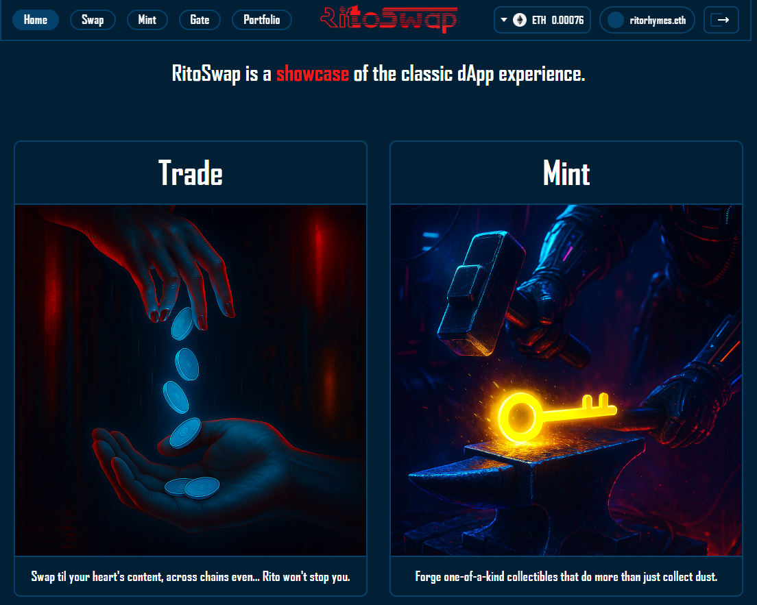
TopNav (desktop version / dv) Sample
Below is a sample image of the UI with TopNav dv.
Notice:
- Menu links on the left
- Logo centered
- Wallet widgets on the right
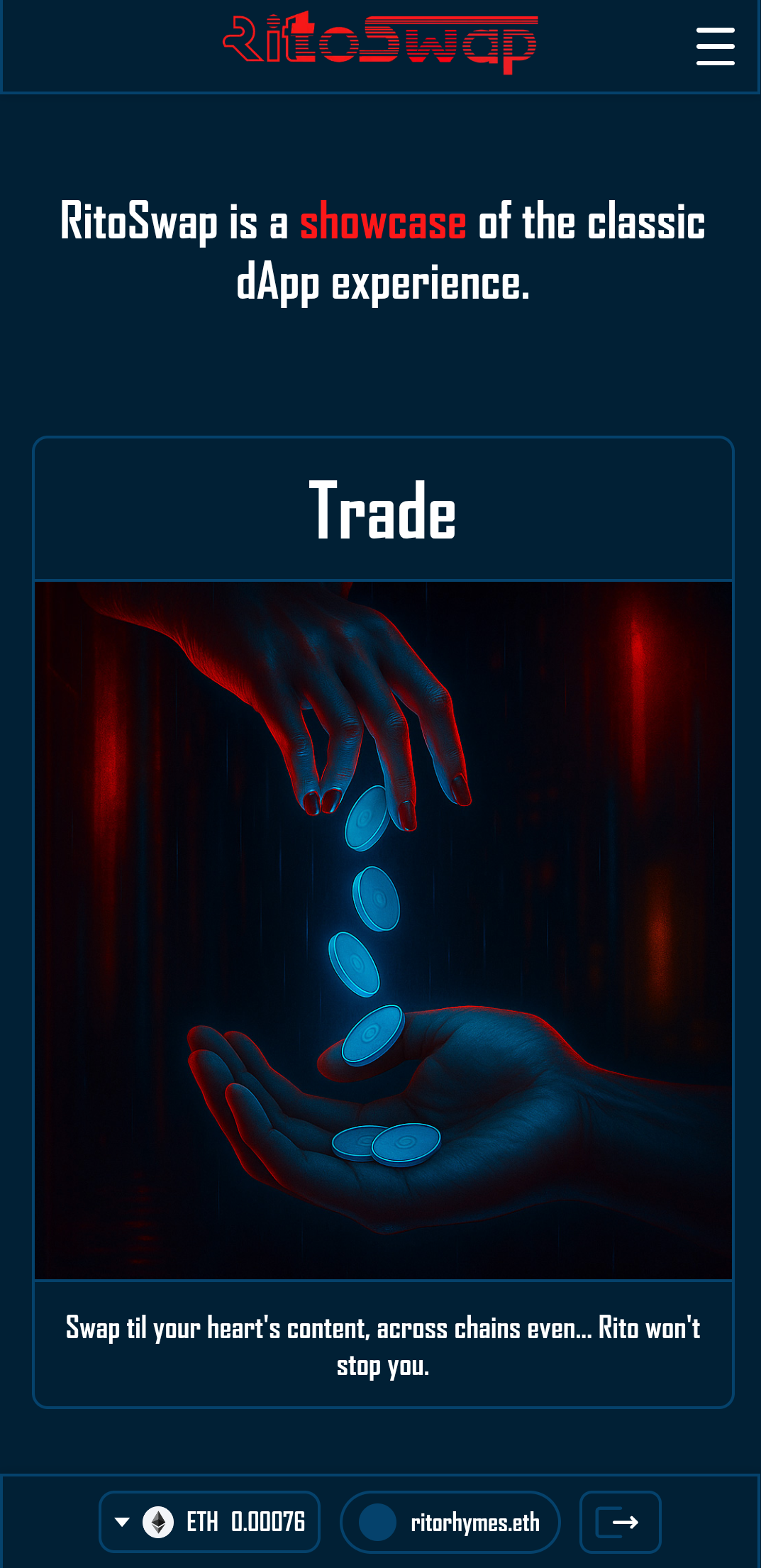
TopNav (mobile version / mv) + BottomNav Sample
Below is a sample image of the UI with TopNav mv and BottomNav.
Notice:
- Top bar: logo + hamburger menu
- Bottom bar: wallet widgets only
Wallet Widgets
This is a brief overview of the Wallet Widgets in relation to the Navbar components, for a full treatment of these Widgets please visit Wallet UI.
The Wagmi library has various hooks the dApp uses to communicate with the wallet and the active blockchain network that are set up in providers.tsx. Neither TopNav nor BottomNav directly utilize any of these hooks, but both of them contain child Wallet Widget components that do use and depend on them (for example useAccount to know the connection state, useDisconnect inside DisconnectButton, and useBalance/useChainId inside NetworkWidget).
There are two sets of Wallet Widgets, one for when a wallet is connected, as seen below:

And another for when no wallet is connected (or after one has been disconnected):

All of the widgets respond to Wagmi connection state (primarily via useAccount); DisconnectButton calls useDisconnect when clicked, and NetworkWidget pulls balances with useBalance.
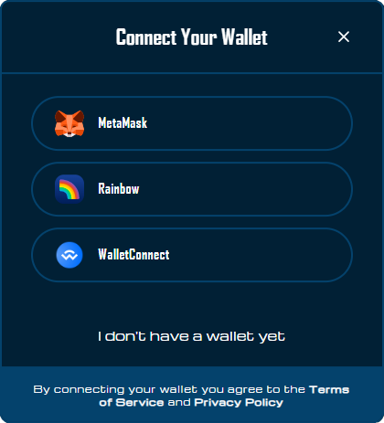
Disconnected State Widget
When there is no wallet connected, the Connect button widget ConnectWrapper becomes visible.

Clicking it triggers the ConnectModal that is used for the flow of selecting a wallet provider and connecting with that wallet.
Connected State Widgets
When there is a wallet connected, the following widgets will appear:
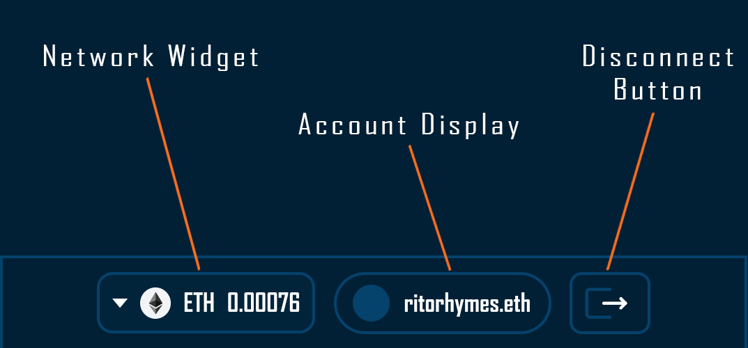
- NetworkWidget: Displays the current network with its icon and native token balance. Clicking opens the network switching modal.
- AddressDisplay: Shows the connected address (truncated) and ENS name/avatar if available. Clicking opens the full account modal.
- DisconnectButton: Provides a clear way to disconnect the wallet.
Variants
Because each component is attached to the different navbars all rendered on the same page, they each need to respect the same breakpoints of the navbar that are attached to. For this, each component has a variant class of topnav or bottomnav where the former will only be visible at 1100px or greater and the latter is only visible under that value.
<div className={styles.walletContainer}>
          <ConnectWrapper variant="topnav" />
          <NetworkWidget variant="topnav" />
          <AddressDisplay variant="topnav" />
          <DisconnectButton variant="topnav" />
        </div>
Menu Links System
The menu links system provides the core navigation functionality for RitoSwap, consisting of two tightly integrated components that work together to create an intuitive navigation experience.
MenuLinks Component
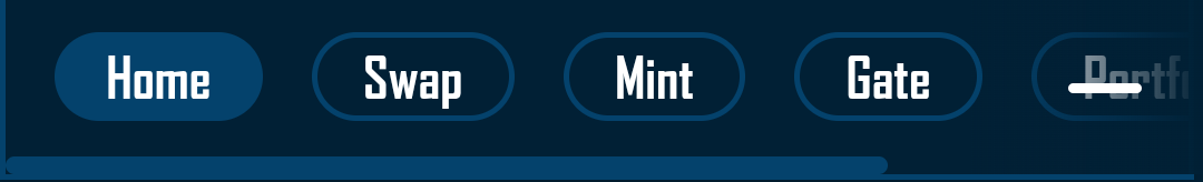
The MenuLinks component serves as the central hub for all navigation links in the application. It maintains a single source of truth for the navigation structure through its exported links array:
export const links = [
  { text: "Home",      href: "/"          },
  { text: "Swap",      href: "/swap"      },
  { text: "Mint",      href: "/mint"      },
  { text: "Gate",      href: "/gate"      },
  { text: "Portfolio", href: "/portfolio" },
];
This design pattern ensures consistency across all navigation implementations - whether rendered in the desktop TopNav, mobile hamburger menu, or any future navigation contexts. The component accepts an optional onClick handler, which proves particularly useful for mobile implementations where you need to close the hamburger menu after a link selection.
MenuLinks Props
| Prop | Type | Required | Description |
|---|---|---|---|
onClick | () => void | No | Optional callback function triggered when any menu link is clicked. Primarily used in mobile navigation to close the hamburger menu after selection. |
ActiveMenuLink Component
The ActiveMenuLink component elevates the standard navigation experience by providing visual feedback about the user’s current location within the application. Built on Next.js’s Link component, it leverages the usePathname hook to determine when its route matches the current page:
const pathname = usePathname();
const isActive = pathname === href;
When active, the component applies distinct styling through CSS modules, creating a clear visual indicator that helps users maintain context as they navigate. The component also implements proper accessibility patterns by setting the aria-current="page" attribute when active, ensuring screen reader users receive the same contextual information as visual users.
The styling approach uses a pill-shaped button design with smooth transitions, transforming from a transparent background to the application’s secondary color on hover or when active. This creates a cohesive visual language that feels responsive and modern while maintaining clarity about navigation state.
ActiveMenuLink Props
| Prop | Type | Required | Description |
|---|---|---|---|
text | string | Yes | The display text for the navigation link. This appears as the visible label users click on. |
href | string | Yes | The destination URL for the navigation link. Used by Next.js Link component for client-side routing. |
onClick | () => void | No | Optional callback function executed when the link is clicked. Passed through from parent MenuLinks component. |
Integration with Navigation System
These components form the foundation of RitoSwap’s navigation, seamlessly adapting to different viewport contexts. In the desktop TopNav, they render horizontally alongside the logo and wallet widgets. In the mobile experience, they appear within the animated hamburger menu dropdown, where the onClick handler ensures the menu closes after navigation, maintaining a smooth user experience.
This modular approach allows the navigation logic to remain decoupled from its presentation context, making the system both maintainable and extensible for future navigation patterns or responsive breakpoints.
TopNav (Desktop Version)
The TopNav component serves as the primary navigation interface for desktop users, implementing a sophisticated three-column layout that balances branding, navigation, and wallet functionality. Let’s explore how this component creates a seamless desktop experience at viewport widths of 1100px and above.
Component Architecture
The TopNav component takes a simple approach for its link visibility: it keeps a buttonsVisible flag set to true so the links always render with the fadeIn class applied. The accompanying CSS controls opacity and transition, keeping the appearance lightweight without additional effects.
Layout Strategy
The TopNav employs a strategic three-column layout that serves distinct purposes:
The left section houses the MenuLinks component, providing immediate access to all major application routes. This placement follows established UX patterns where primary navigation typically resides on the left side of the interface in left-to-right reading cultures.
The center section features the RitoSwap logo, implemented as a clickable link to the home page. This central branding creates a strong visual anchor and provides users with a reliable way to return to the homepage - a common expectation in modern web applications. The logo implementation showcases Next.js Image component best practices:
<Image
  src="/images/brand/ritoswap.png"
  alt="Logo"
  width={250}
  height={0}
  style={{ height: 'auto', width: '100%' }}
  priority
/>
Notice how the height is set to 0 with auto styling, allowing the image to maintain its aspect ratio while being responsive to its container. The priority prop ensures the logo loads immediately, preventing layout shift as the page renders.
The right section contains the wallet widget cluster, creating a dedicated space for blockchain interaction controls. This spatial organization helps users develop muscle memory for wallet-related actions.
The Spacer Pattern
One particularly clever aspect of TopNav is its use of a spacer div:
<>
  <div className={styles.container} data-testid="header">
    {/* ... navigation content ... */}
  </div>
  <div className={styles.spacer} />
</>
This pattern solves a common challenge in fixed navigation systems. The spacer div reserves vertical space in the document flow equal to the height of the fixed navigation bar, preventing content from sliding underneath the navigation when the page loads. This approach is more maintainable than adding top padding to every page component, as any changes to the navigation height only require updating the spacer’s CSS.
Responsive Design Philosophy
While this is the desktop version, the component is built with responsiveness in mind. At 1100px and above, all elements display in their full glory. The CSS modules approach (importing from TopNav.module.css) ensures styles remain scoped and don’t leak into other components, while the semantic test ID (data-testid="header") facilitates automated testing.
Integration with Wallet System
The TopNav creates a unified container for all wallet-related widgets:
<div className={styles.walletContainer}>
  <ConnectWrapper variant="topnav" />
  <NetworkWidget variant="topnav" />
  <AddressDisplay variant="topnav" />
  <DisconnectButton variant="topnav" />
</div>
Each widget receives the “topnav” variant prop, which these components use internally to apply appropriate styling and visibility rules. This variant system ensures that the desktop navigation widgets remain hidden on mobile viewports, where their bottom navigation counterparts take over.
TopNav Props
This component takes no props. The TopNav is designed as a self-contained navigation system that manages its own state and behavior internally. All customization happens through CSS modules and the child components it renders.
Summary
The TopNav desktop version represents more than just a navigation bar - it’s a carefully orchestrated system that manages layout, animations, responsive behavior, and integration with blockchain functionality. By understanding these implementation details, developers can maintain consistency when extending the navigation or troubleshooting issues. The component exemplifies modern React patterns while solving real-world challenges like layout stability and smooth user experiences.
Playground
TopNav (Mobile Version)
Below 1100px, the TopNav adapts to mobile constraints by displaying only the logo and hamburger menu. This strategic choice keeps the header uncluttered and delegates wallet controls to the BottomNav, where they’re more accessible to thumbs.
Default State

The mobile TopNav contains just two elements: the centered RitoSwap logo and a hamburger icon on the right. The wallet widgets that appear in desktop view are hidden via the variant="topnav" prop, which applies display rules based on viewport width.
Menu Open State
When activated, the MobileNav slides down to cover the logo while the hamburger transforms to indicate the open state. The menu items can scroll horizontally if needed, future-proofing the design for additional navigation links.
Technical Implementation
The Hamburger component manages the menu state and implements click-outside detection to automatically close the menu:
useEffect(() => {
  const handler = (e) => {
    if (!open) return;
    if (
      hamRef.current?.contains(e.target) ||
      menuRef.current?.contains(e.target)
    ) return;
    setOpen(false);
  };
  document.addEventListener('mousedown', handler);
  return () => document.removeEventListener('mousedown', handler);
}, [open]);
Hamburger Props
The Hamburger component takes no props. It manages all menu state internally and handles the rendering of the MobileNav component when opened. This encapsulation keeps the component’s API simple while maintaining full control over the mobile menu behavior.
MobileNav Component
The MobileNav component uses Framer Motion for smooth slide-down animations:
<motion.div
  initial={{ opacity: 0, y: -100 }}
  animate={{ opacity: 1, y: 0 }}
  exit={{ opacity: 0, y: -100 }}
  transition={{ duration: 0.3, ease: "easeInOut" }}
>
A gradient backdrop provides visual separation between the menu and page content. When users tap a menu link, the onClick handler passed to MenuLinks automatically closes the menu, creating a smooth navigation flow without requiring manual dismissal.
MobileNav Props
| Prop | Type | Required | Description |
|---|---|---|---|
innerRef | React.RefObject<HTMLDivElement> | Yes | Reference to the menu container element. Used by the parent Hamburger component for click-outside detection logic. |
onClose | () => void | Yes | Callback function to close the mobile menu. Triggered when users click outside the menu or select a navigation link. |
This approach keeps the mobile header lightweight while maintaining full navigation capabilities, setting up the BottomNav to handle wallet interactions where they’re most ergonomically accessible.
Playground
BottomNav
The BottomNav component provides persistent access to wallet controls at the bottom of mobile viewports, positioning these frequently-used functions within natural thumb reach. This component appears exclusively below the 1100px breakpoint, creating a mobile-first wallet management experience.
CSS-Based Visibility Control
Unlike many responsive navigation systems that rely on conditional rendering, BottomNav uses pure CSS for its show/hide behavior. This approach offers performance benefits since components remain mounted in the DOM and simply toggle their visibility:
/* styles/wallet-variants.css */
.topnav {
  display: none;
}
.bottomnav {
  display: flex;
}

@media (min-width: 1100px) {
  .topnav     { display: flex; }
  .bottomnav  { display: none; }
}
This CSS-based approach eliminates the overhead of mounting and unmounting components during viewport changes. React doesn’t need to reconcile the component tree when users rotate their devices or resize their browsers - the browser’s CSS engine handles everything, which is inherently faster than JavaScript-based solutions.
Unified Variant System
The BottomNav shares the same variant class system as the wallet widgets it contains. Each widget receives variant="bottomnav", which maps to the CSS classes shown above. This creates a single point of control: modifying the .bottomnav class in wallet-variants.css affects both the container and all child widgets simultaneously.
<div className={styles.container}>
  <ConnectWrapper variant="bottomnav" />
  <NetworkWidget variant="bottomnav" />
  <AddressDisplay variant="bottomnav" />
  <DisconnectButton variant="bottomnav" />
</div>
Technical Benefits
The CSS-only visibility approach provides several advantages:
- Faster initial render - Components load once and stay loaded, avoiding re-render cycles
- Smoother transitions - CSS transforms can be hardware-accelerated
- Simplified state management - No need to track viewport size in React state
- Better performance on device rotation - Instant response without JavaScript execution
Fixed Positioning Strategy
BottomNav uses fixed positioning to remain accessible regardless of scroll position. This creates a persistent UI element that users can rely on for wallet interactions without hunting through the page. Unlike TopNav, it does not render a spacer, so pages that need to avoid overlap should add their own bottom padding or margin.
BottomNav Props
This component takes no props. Like TopNav, the BottomNav is designed as a self-contained system that renders the appropriate wallet widgets based on connection state. All responsive behavior is handled through CSS, making the component’s API intentionally minimal.
Integration with Mobile UX
By housing all wallet controls in a dedicated bottom bar, the mobile experience maintains clear separation of concerns. Navigation lives at the top, wallet controls at the bottom, and content flows freely in between. This arrangement leverages established mobile UX patterns where bottom navigation has become the standard for frequently-accessed functions in mobile applications.
Playground
Z-Index Hierarchy and Footer Interaction
Both TopNav and BottomNav implement a carefully designed z-index system that allows the footer to occlude them when users scroll to the bottom of the page. This intentional behavior recognizes that navigation and wallet controls are needed when interacting with dApp functionality but become redundant when viewing footer content like links, documentation, or company information.
This z-index strategy serves a practical purpose: it prevents the fixed navigation elements from creating awkward overlaps with footer elements or blocking important footer links. When users scroll down to read footer content, both navigation bars gracefully slide behind it, creating a cleaner visual hierarchy. When they scroll back up to interact with the dApp, the navigation controls reappear exactly where expected. This creates a context-aware interface that adapts to user intent without requiring explicit show/hide controls.