NetworkWidget Widget
- NetworkWidget.tsx
- NetworkWidget.module.css
- NetworkModal.tsx
Overview
The NetworkWidget serves as the primary visual indicator of blockchain network status and native token balance within the RitoSwap interface. As part of the Wallet UI widget collection, this component provides users with immediate awareness of the selected view chain through branded visual elements and real-time balance information. The widget represents one of the core connected-state components that automatically appears when a wallet connection is established.
For the dapp chain model (view chain vs wallet chain vs active chain), see Dapp Chain State.

Built on Wagmi v2’s network and balance management hooks, NetworkWidget orchestrates multiple data sources to create a comprehensive network status display. The component uniquely integrates with RitoSwap’s custom Chain Info Provider system to fetch and display blockchain logos, working in tandem to transform technical chain identifiers into visually recognizable brands. This partnership between Wagmi’s connectivity layer and the Chain Info Provider’s visual assets creates a rich user experience that helps users immediately identify their selected view chain.
Component Architecture
The NetworkWidget demonstrates sophisticated integration between multiple systems to deliver a seamless network identification experience. At its core, the component bridges Wagmi’s technical blockchain data with visual presentation layers, creating an interface element that communicates complex network state through simple, recognizable imagery.
Integration with Chain Info Provider
While Wagmi provides essential blockchain connectivity and chain identification, it lacks visual assets and user-friendly naming conventions. The NetworkWidget addresses this limitation through deep integration with the Chain Info Provider system, which extends Wagmi’s capabilities with logo management and display name normalization.
The component accesses the Chain Info Provider through the useChainInfo hook:
const {
  getChainLogoUrl,
  getFallbackLogoUrl,
} = useChainInfo();
This integration enables the widget to display blockchain logos fetched from TrustWallet’s CDN, with intelligent fallback handling when assets are unavailable. The Chain Info Provider manages the complexity of CDN URL construction, special case handling for chains with non-standard naming conventions, and custom chain support for local development networks. For comprehensive documentation on the Chain Info Provider’s capabilities and configuration options, refer to the Chain Info Provider documentation.
Native Token Symbol Resolution
The widget implements a multi-layered approach to determining the correct native token symbol for display. First, it consults a hardcoded mapping for well-known chains where the native token symbol differs from the chain’s default currency:
const NATIVE_TOKENS: { [chainId: number]: string } = {
  1: "ETH",      // Ethereum
  137: "MATIC",  // Polygon
  42161: "ETH",  // Arbitrum
};
When the current chain ID exists in this mapping, the widget uses the specified symbol. Otherwise, it falls back to the chain’s native currency symbol provided by Wagmi. This approach ensures accurate token representation across different networks while maintaining flexibility for custom chains.
Visual Design and Functionality
The NetworkWidget implements a compact yet information-rich design that balances visual appeal with functional clarity. The component displays four key elements in a horizontally aligned layout: a dropdown indicator, blockchain logo, native token symbol, and current balance. This arrangement creates a scannable interface element that users can quickly parse for essential network information.
The dropdown icon serves as both a visual cue and functional indicator. Rendered as a downward-pointing triangle, it signals to users that the widget is interactive and will reveal additional options when clicked. This follows established UI patterns where dropdown indicators suggest expandable content.
The blockchain logo provides immediate visual identification of the selected view chain. By leveraging recognizable brand imagery from the Chain Info Provider, users can identify their network at a glance without reading text labels. This visual recognition proves particularly valuable when switching between multiple view chains during a session.
Balance Display Logic
The NetworkWidget implements sophisticated balance formatting logic designed to maintain consistent visual dimensions regardless of token value. This system ensures the widget maintains a stable width whether displaying fractional amounts or large holdings.
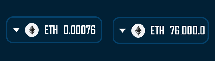
The formatting algorithm follows a precise set of rules to achieve this consistency:
const raw = parseFloat(formatUnits(balance.value, balance.decimals));
const intLen = Math.floor(raw).toString().length;
const fracDigits = Math.max(0, 6 - intLen);
display = raw.toFixed(fracDigits);
This approach allocates six total digits for display, dynamically adjusting decimal places based on the integer portion’s length. Small values like 0.00076 display with five decimal places, while large values like 76000.0 show only one decimal place. This creates visual consistency while maximizing precision for small amounts and readability for large amounts.
Technical Implementation
Wagmi v2 Hook Integration
NetworkWidget leverages Wagmi v2 hooks plus the dapp chain provider to manage its functionality:
useAccount provides wallet connection status and the connected address. The component uses these values to control visibility and enable balance queries. The isConnected property determines whether the widget should appear, while the address property serves as the parameter for balance lookups.
useDappChain supplies the dapp view-chain ID (dappChainId), which the widget uses for native token symbol resolution and chain identification. This lets the UI reflect the selected view chain even when the wallet remains on another network.
useBalance fetches the native token balance for the connected address on the selected view chain. The hook returns balance data including the raw value and decimal places, along with loading states that the widget uses to display appropriate feedback during data fetching. The component formats this raw balance data into user-friendly display values.
State Management and Lifecycle
The widget implements careful state management to coordinate its appearance with wallet connection events:
const [showComponent, setShowComponent] = useState<boolean>(
  variant === "no-nav"
);
const [isModalOpen, setIsModalOpen] = useState(false);
const [isLeaving, setIsLeaving] = useState(false);
The component manages three distinct states. The showComponent state controls overall visibility, implementing the same delayed mounting pattern as other wallet widgets. The isModalOpen state tracks the NetworkModal’s visibility when users click the widget. The isLeaving state manages opacity during disconnection, providing immediate visual feedback. Balance and logo data are driven by the dapp chain selection rather than the wallet chain.
Lifecycle Mount/Unmount Summary
When variant !== "no-nav":
-
Mount Delay (100 ms)
Waits 100 ms after detectingisConnected === truebefore rendering. This gives Wagmi time to rehydrate from localStorage and prevents a brief flash of the disconnected state on reload or network switch. -
Immediate Unmount & Fade on Disconnect
As soon asisConnectedgoesfalse, setsisLeaving(opacity → 0) and unmounts the component immediately, delivering instantaneous visual feedback without stale UI.
When variant === "no-nav", the widget bypasses the delay and mounts immediately on page load.
Error Handling and Fallbacks
The widget implements comprehensive error handling to ensure reliable display under various conditions. When no wallet is connected or chain data is unavailable, the component displays a fallback interface with question marks and “unknown” labels. This prevents empty states while maintaining the widget’s visual structure.
Logo loading implements a two-tier fallback system. The component first attempts to load the chain-specific logo from the CDN. If this fails due to network issues or missing assets, an error handler replaces the source with a fallback logo:
onError={(e) => {
  e.currentTarget.onerror = null;
  e.currentTarget.src = fallback;
}}
Props Reference
| Prop | Type | Default | Description |
|---|---|---|---|
variant | "topnav" | "bottomnav" | "no-nav" | "no-nav" | Controls responsive visibility behavior. The topnav variant displays only above 1100px, bottomnav only below 1100px, and no-nav always displays. See the Navbar System Guide for complete variant system documentation. |
Variant System Behavior
The variant prop controls CSS-based responsive visibility, which operates independently from the component’s connection state logic. While connection state determines whether the component renders at all through conditional rendering, the variant system uses CSS classes to show or hide already-rendered components based on viewport width.
| Variant Value | Visible Range | Hidden Range | Use Case |
|---|---|---|---|
"topnav" | 1100px and above | Below 1100px | Desktop navigation bars |
"bottomnav" | Below 1100px | 1100px and above | Mobile bottom navigation |
"no-nav" (default) | Always visible | Never hidden | Standalone usage outside navigation |
| No prop provided | Always visible | Never hidden | Same as "no-nav" |
This CSS-based approach ensures smooth responsive behavior without the performance overhead of mounting and unmounting components during viewport changes. The component remains in the DOM regardless of variant visibility, maintaining its internal state across breakpoint transitions.
CSS Architecture
The widget’s visual presentation relies on carefully structured CSS that creates a cohesive, interactive interface element. The styling approach emphasizes clarity and functionality while maintaining consistency with RitoSwap’s broader design system.
Container Structure
The widget implements a nested container structure that separates interaction boundaries from content layout:
.wrapper {
  display: inline-flex;
  border: var(--default-border);
  border-radius: 10px;
  padding: 0.5rem .5rem;
  background: rgba(4, 66, 108, 0.1);
  cursor: pointer;
}

.container {
  display: flex;
  align-items: center;
  gap: 0.5rem;
}
The wrapper handles visual styling and interaction states, while the inner container manages content alignment. This separation enables precise control over hover effects without affecting content positioning.
Visual Feedback
The widget provides clear visual feedback through background color transitions on hover. The semi-transparent blue background in the default state transitions to the application’s secondary color, creating a subtle but noticeable interaction cue. This feedback mechanism aligns with other interactive elements throughout RitoSwap, maintaining consistency in user experience patterns.
Integration with NetworkModal
Clicking the NetworkWidget opens the NetworkModal, which presents available networks for switching. This modal provides a comprehensive list of supported blockchains, each displaying its logo and name for easy identification. The integration maintains clean separation between trigger and modal components through React state management:
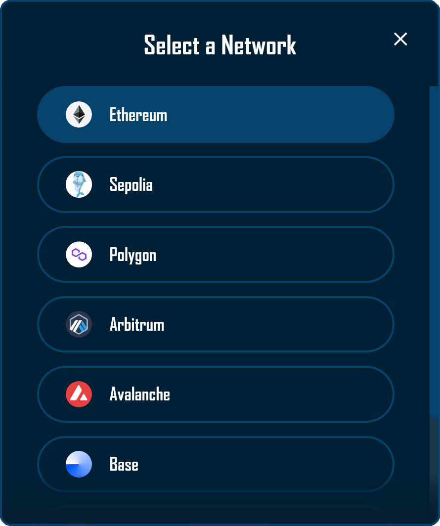
The modal receives its visibility state through the isOpen prop and communicates closure through the onClose callback. This pattern enables the widget to control modal display while keeping the components loosely coupled.
Usage Examples
Basic Implementation
import NetworkWidget from '@/components/wallet/network/NetworkWidget';

// Standalone usage anywhere in your application
function CustomPanel() {
  return (
    <div className={styles.panel}>
      <NetworkWidget />
    </div>
  );
}
Navigation Integration
// Desktop navigation bar
<div className={styles.topNav}>
  <NetworkWidget variant="topnav" />
</div>

// Mobile bottom navigation
<div className={styles.bottomNav}>
  <NetworkWidget variant="bottomnav" />
</div>
Best Practices
When implementing NetworkWidget, ensure both Wagmi configuration and the Chain Info Provider are properly initialized in your application’s provider hierarchy. The widget depends on both systems functioning correctly to display accurate network information and visual assets.
Configure chain overrides in the Chain Info Provider for any custom networks or chains with non-standard CDN naming. This ensures logos display correctly and prevents fallback images from appearing unnecessarily. Refer to the Chain Info Provider documentation for detailed configuration instructions.
Consider the widget’s placement carefully within your interface. Position it alongside other wallet-related widgets to create a cohesive wallet management area. The consistent 6-digit balance display ensures the widget maintains stable dimensions, preventing layout shifts as balances change.
Monitor the balance loading states in production environments. While the widget handles loading states gracefully, understanding typical loading times helps identify potential RPC performance issues that might impact user experience.
The NetworkWidget’s 6-digit balance display system dynamically adjusts decimal places based on value magnitude. This approach maximizes precision for small amounts while maintaining readability for large holdings, ensuring users always see meaningful balance information regardless of their token quantity.
Playground
Use the full Storybook UI to explore the widget states and tweak controls in real time.