Network Modal
- NetworkModal.tsx
- NetworkModal.module.css
- NetworkWidget.tsx
Overview
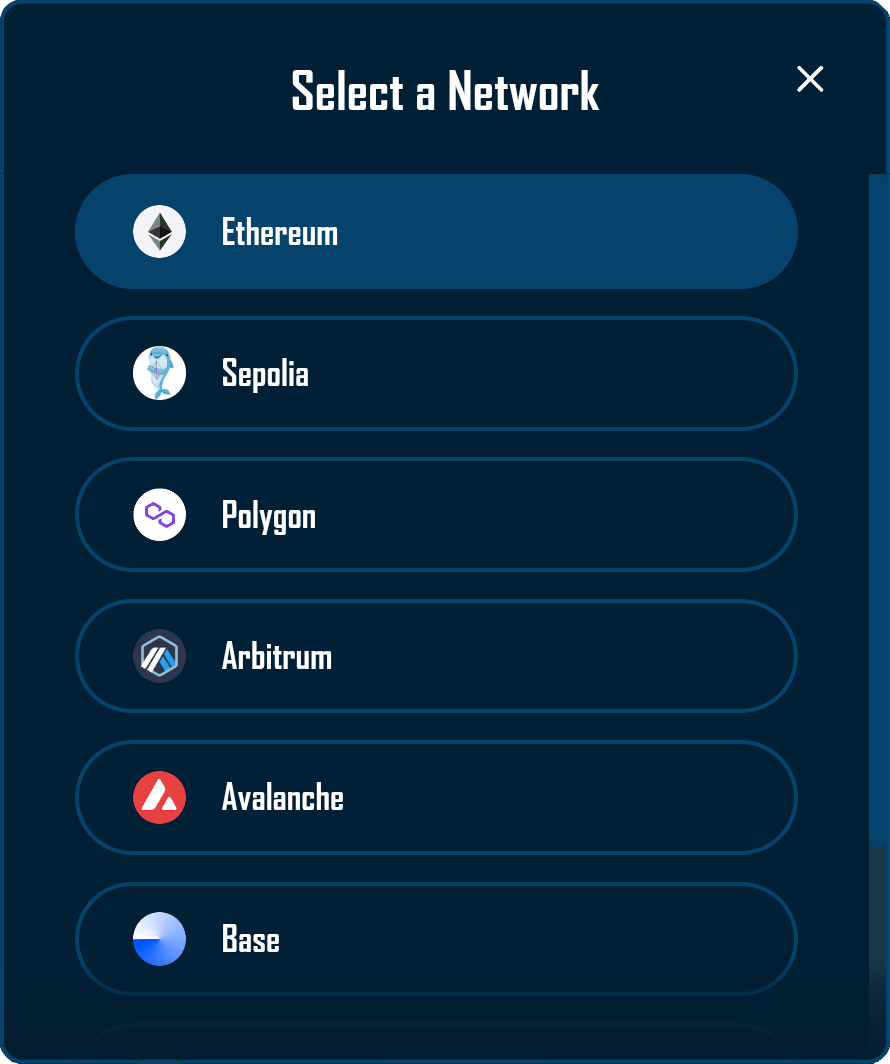
The Network Modal serves as the primary interface for dapp network selection within the RitoSwap ecosystem. This modal component provides users with a visually rich selection interface displaying all configured networks with their respective logos and names. As part of the Wallet UI widget collection, the modal offers an intuitive way to switch the view chain used by the UI while maintaining awareness of the currently selected chain through visual highlighting.
Built on Wagmi v2’s chain configuration and RitoSwap’s dapp chain state, the Network Modal orchestrates view-chain selection with immediate visual feedback and smooth transitions. The component integrates deeply with RitoSwap’s Chain Info Provider system to transform technical chain identifiers into recognizable blockchain brands through logo display and name normalization. This modal can be triggered by any component that manages its open state, most commonly through the NetworkWidget or the AccountModal.
For the full view-chain model (dapp chain vs wallet chain vs active chain), see Dapp Chain State.
Component Architecture
The Network Modal demonstrates sophisticated integration between wagmi chain configuration and the dapp chain state. The component creates a portal-based overlay that renders above all other content, ensuring consistent accessibility regardless of the triggering component’s position in the DOM hierarchy.
Triggering Mechanisms
While the Network Modal itself is a controlled component that responds to external state management, it’s most commonly triggered by the NetworkWidget component. When users click the NetworkWidget, it updates its internal state to open the modal:

// In NetworkWidget.tsx
const [isModalOpen, setIsModalOpen] = useState(false);

// Clicking the widget opens the modal
<div onClick={() => setIsModalOpen(true)}>
  {/* Widget content */}
</div>

// Modal receives state through props
<NetworkModal
  isOpen={isModalOpen}
  onClose={() => setIsModalOpen(false)}
/>
This architecture ensures the modal remains decoupled from its triggers, allowing any component to control its visibility through simple boolean state management.
Integration with Chain Info Provider
The Network Modal leverages the Chain Info Provider system to enhance Wagmi’s technical blockchain data with visual assets and user-friendly naming. While Wagmi provides the list of configured chains, it lacks the visual elements necessary for intuitive network selection.
The component accesses the Chain Info Provider through the useChainInfo hook:
const {
  getChainLogoUrl,
  getFallbackLogoUrl,
  getChainDisplayName
} = useChainInfo();
This integration enables the modal to display blockchain logos fetched from TrustWallet’s CDN, with intelligent fallback handling when assets are unavailable. The Chain Info Provider manages the complexity of CDN URL construction, special case handling for chains with non-standard naming conventions, and custom chain support for local development networks. For comprehensive documentation on the Chain Info Provider’s capabilities and configuration options, refer to the Chain Info Provider documentation.
Portal Rendering Strategy
The Network Modal implements React’s portal pattern to ensure proper rendering above all other content:
return createPortal(
  <>
    <div className={styles.backdrop} onClick={onClose} />
    <div className={styles.modalWrapper}>
      {/* Modal content */}
    </div>
  </>,
  document.body
);
This approach prevents z-index conflicts and ensures the modal always appears above other interface elements, regardless of nested component hierarchies or CSS stacking contexts.
Visual Design and Functionality
The Network Modal implements a clean, focused design that emphasizes clarity and ease of selection. The interface presents blockchain networks in a vertically scrollable list, with each network displayed as a pill-shaped button containing the chain’s logo and name.
View-Chain Highlighting
The modal automatically identifies and visually highlights the currently selected view chain, always positioning it at the top of the list for immediate recognition. This design decision reduces cognitive load by clearly distinguishing the current network from available alternatives:
const sortedChains = [...chains].sort((a, b) => {
  if (a.id === dappChainId) return -1;
  if (b.id === dappChainId) return 1;
  return 0;
});
The selected view chain receives distinct visual treatment through background color changes, creating a clear hierarchy within the selection interface.
Interaction Patterns
The modal supports multiple dismissal methods to accommodate different user preferences and device types:
Click Outside: Users can tap the backdrop area to close the modal, following standard modal interaction patterns.
Close Button: A prominent × button in the top-right corner provides explicit dismissal control.
Swipe Gesture: On touch devices, users can swipe left to dismiss the modal, enhancing mobile usability:
const swipeHandlers = useSwipeable({
  onSwipedLeft: () => onClose(),
  preventScrollOnSwipe: true,
  delta: { left: 50 },
  swipeDuration: 300,
});
Network Selection: Clicking any network button updates the view chain and closes the modal, providing instant feedback without forcing a wallet switch.
Visual Hierarchy and Scrolling
The modal implements a sophisticated visual structure with three distinct sections:
Header Section: Contains the modal title and close button, remaining fixed during scrolling.
Scrollable Content: The network list scrolls independently when content exceeds viewport height, with custom scrollbar styling that matches the application’s design language.
Bottom Gradient: A subtle gradient overlay at the bottom provides visual indication of additional content below the fold, enhancing discoverability of networks lower in the list.
Technical Implementation
Wagmi v2 Hook Integration
The Network Modal leverages Wagmi v2 hooks and the dapp chain provider to manage network selection:
useAccount provides connection status. The component uses this value to automatically close if the user disconnects their wallet during interaction.
useConfig supplies the complete list of configured chains available for selection. This ensures the modal always displays the current configuration without manual updates.
useDappChain provides dappChainId and setDappChainId, which update the view chain used by the UI:
const { dappChainId, setDappChainId } = useDappChain();

// Network button click handler
onClick={() => {
  setDappChainId(chain.id);
  onClose();
}}
State Management and Effects
The modal implements careful state coordination to ensure proper behavior across different scenarios:
useEffect(() => {
  if (!isConnected && isOpen) onClose();
}, [isConnected, isOpen, onClose]);
This effect ensures the modal automatically closes if the user disconnects their wallet while it’s open, preventing confusing states where network selection would be meaningless.
Error Handling and Fallbacks
The modal implements comprehensive error handling for logo loading failures:
onError={(e) => {
  e.currentTarget.onerror = null;
  e.currentTarget.src = getFallbackLogoUrl();
}}
This two-tier system first attempts to load chain-specific logos from the CDN, then falls back to a generic placeholder if loading fails. The error handler prevents infinite retry loops by nullifying the error handler after the first failure.
Props Reference
| Prop | Type | Required | Description |
|---|---|---|---|
isOpen | boolean | Yes | Controls the modal’s visibility. When true, the modal renders with animation. When false, the modal unmounts from the DOM. |
onClose | () => void | Yes | Callback function invoked when the modal should close. Called on backdrop click, close button click, swipe gesture, or network selection. |
CSS Architecture
The modal’s styling architecture creates a layered visual experience with careful attention to animation and responsiveness.
Backdrop and Blur Effects
The backdrop creates a semi-transparent overlay with backdrop blur, focusing user attention on the modal content:
.backdrop {
  position: fixed;
  top: 0;
  left: 0;
  right: 0;
  bottom: 0;
  background: rgba(0, 0, 0, 0.4);
  backdrop-filter: blur(20px);
  -webkit-backdrop-filter: blur(20px);
  z-index: 2000;
  animation: fadeIn 0.2s ease-out;
}
The blur effect creates depth and maintains visual connection to the underlying interface while clearly delineating the modal interaction space.
Animation System
The modal implements a two-stage animation system. The backdrop fades in quickly to provide immediate feedback, while the modal content slides in with a subtle upward motion:
@keyframes slideIn {
  from {
    opacity: 0;
    transform: translate(-50%, -45%);
  }
  to {
    opacity: 1;
    transform: translate(-50%, -50%);
  }
}
This creates a smooth, professional appearance that enhances the perception of interface responsiveness.
Responsive Design
The modal adapts to different viewport sizes while maintaining usability:
.modal {
  width: 400px;
  max-width: 90vw;
  max-height: 80vh;
}

@media (max-width: 480px) {
  .modal {
    width: 95vw;
  }
}
On mobile devices, the modal expands to use available screen width while maintaining appropriate padding for touch targets.
Usage Examples
Basic Implementation with NetworkWidget
import NetworkWidget from '@/components/utilities/wallet/network/NetworkWidget';
import NetworkModal from '@/components/utilities/wallet/network/NetworkModal';

function Navigation() {
  const [isNetworkModalOpen, setIsNetworkModalOpen] = useState(false);

  return (
    <>
      <div onClick={() => setIsNetworkModalOpen(true)}>
        <NetworkWidget />
      </div>

      <NetworkModal
        isOpen={isNetworkModalOpen}
        onClose={() => setIsNetworkModalOpen(false)}
      />
    </>
  );
}
Custom Trigger Implementation
// Any component can trigger the modal
function CustomNetworkSelector() {
  const [showModal, setShowModal] = useState(false);

  return (
    <>
      <button
        onClick={() => setShowModal(true)}
        className={styles.customTrigger}
      >
        Change Network
      </button>

      <NetworkModal
        isOpen={showModal}
        onClose={() => setShowModal(false)}
      />
    </>
  );
}
Integration with Global State
// Using with state management libraries
function AppWithNetworkModal() {
  const { isNetworkModalOpen, closeNetworkModal } = useAppState();

  return (
    <NetworkModal
      isOpen={isNetworkModalOpen}
      onClose={closeNetworkModal}
    />
  );
}
Best Practices
When implementing the Network Modal, ensure proper state management in the parent component. The modal itself is stateless and relies entirely on props for visibility control, making it predictable and easy to test.
Configure chain information in the Chain Info Provider for all networks your application supports. This ensures logos display correctly and chain names appear in user-friendly formats. Missing configuration will result in fallback placeholders that diminish the user experience.
Test the modal behavior across different viewport sizes and devices. The swipe-to-dismiss gesture should feel natural on mobile devices without interfering with vertical scrolling of the network list.
Monitor view-chain selection behavior in production. Although this modal does not switch the wallet network, you should still confirm that the UI updates promptly and balances render as expected.
The Network Modal’s automatic positioning of the active chain at the top of the list reduces the time users spend searching for their current network. This design decision becomes particularly valuable in applications supporting many chains, where finding the active network in an unsorted list could create friction in the user experience.
Playground
Use the full Storybook UI to explore the modal states and tweak controls in real time.