Wallet UI System
The RitoSwap Wallet UI represents a comprehensive interface layer that bridges your users with the blockchain. Built as a fully custom solution on top of wagmi and TanStack Query , it serves as the primary gateway for wallet connections, transaction management, and blockchain state visualization within the RitoSwap ecosystem.
System Overview
At its core, the Wallet UI system transforms complex blockchain interactions into intuitive user experiences. When users arrive at RitoSwap, they encounter a thoughtfully designed interface that handles everything from initial wallet connection to real-time network monitoring and transaction processing. This isn’t just about connecting a wallet—it’s about creating a seamless bridge between traditional web experiences and the decentralized world.
The system provides three fundamental capabilities that define the user’s journey through the dApp.
- Identity & Connection: allows users to connect their preferred wallet providers and maintain persistent sessions.
- Real-Time State Management: displays current view-chain status, native token balances, and account information at a glance.
- Transaction Orchestration: provides clear feedback during transaction signing, processing, and completion states.
Architecture Foundation
The decision to build on wagmi wasn’t arbitrary—it represents a commitment to reliability and security in an ecosystem where trust is paramount. Wagmi provides battle-tested abstractions over the Ethereum provider ecosystem, handling the complexities of wallet standards, network switching, and transaction management. By leveraging wagmi’s robust foundation, the RitoSwap Wallet UI inherits years of community testing and security hardening.
TanStack Query complements wagmi by managing the asynchronous state that defines blockchain interactions. Every balance check, every network query, and every transaction status update flows through TanStack Query’s caching and synchronization mechanisms. This ensures that users always see accurate, up-to-date information without unnecessary network requests or stale data issues.
Design Philosophy
The Wallet UI system emerged from specific design goals that differentiate it from off-the-shelf solutions. While the primary connect modal is inspired by the design and flow of ConnectKit’s clean aesthetics, the need for deeper customization and mobile-first experiences drove the development of a fully custom implementation of that and all other Wallet UI components.
Central to the design philosophy is the unwavering commitment to RitoVision’s distinctive aesthetic vision. RitoVision, the creative force behind RitoSwap, brings a Blade Runner-esque cool blue atmosphere that flows through every pixel and border of the interface. It’s about creating a cohesive visual narrative that bridges RitoVision’s established Web2 presence at ritovision.com with the decentralized future. Users transitioning from RitoVision’s traditional web properties immediately recognize the visual continuity and prestine attention to atmospheric detail that makes interacting with blockchain technology feel like stepping into a spaceship that moonlights as nightclub.
The visual design adheres to this global theme while maintaining locally scoped CSS modules for each component. This approach ensures visual consistency across the dApp while preventing style conflicts and enabling component-level customization. Every button glow, every modal fade, and every widget animation reflects the RitoVision brand identity through carefully orchestrated visual effects that make Web3 feel less like foreign technology and more like a natural evolution of the digital experience.
Mobile experience received particular attention. WalletConnect handoff still happens during the connection flow in the Connect Modal, but the dapp now separates the generic WalletConnect path from a chooser-driven mobile-wallet path. Post-connect signing and transaction flows reuse openWalletDeeplink, which will relaunch the active chooser-selected wallet when one exists and otherwise falls back to the generic WalletConnect placeholder. Current behavior and constraints are documented in the Mobile Wallet Deeplinking guide.
Component Architecture
- ConnectButton
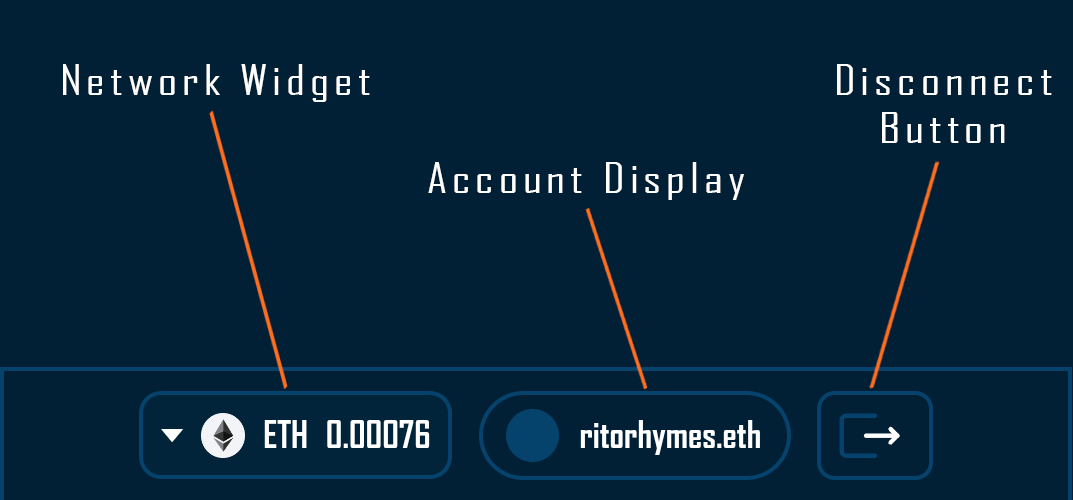
- AddressDisplay
- NetworkWidget
- DisconnectButton
- ConnectModal
- AccountModal
- NetworkModal
The Wallet UI system divides its functionality into two distinct component categories, each serving specific interaction patterns within the dApp.
Widgets: Modular State-Based Components
Widgets are self-contained, modular components that dynamically respond to wallet connection states. These components can be placed anywhere within your application—whether in headers, sidebars, custom panels, or embedded within page content. Their modular architecture means they function independently, requiring only access to wagmi’s providers to operate correctly.
The fundamental characteristic of these widgets is their reactive nature. Each widget subscribes to specific wagmi hooks and state values, automatically updating their visibility and content based on the current wallet connection status. When a user’s wallet state changes—connecting, disconnecting, or switching accounts—the widgets instantly reflect these changes without any manual state management from the developer. This reactive behavior is powered by wagmi’s underlying state system, which propagates updates through React’s context and hook mechanisms.
These components also demonstrate intelligent state-based rendering. The ConnectButton widget, for instance, monitors the connection state through wagmi’s useAccount hook. When no wallet is detected, it renders as an inviting call-to-action. Once a connection is established, it automatically unmounts itself, making room for the connected-state widgets to take over. This orchestrated behavior happens seamlessly, creating a fluid user experience that adapts to the user’s current context.
Beyond their core wagmi integration, widgets tap into additional data providers to enrich their display. The NetworkWidget relies on the Chain Info Provider for chain logos, naming, and native token metadata, while the AddressDisplay integrates with ENS resolution services for avatar fetching. This extensibility allows developers to enhance the visual richness and information density of these components while maintaining their core simplicity.
The widget system consists of four core components:
- ConnectButton: A connection initiator that only renders when no wallet is connected, automatically hiding once a successful connection is established
- AddressDisplay: Shows the connected account’s truncated address, with optional ENS name and avatar resolution capabilities
- NetworkWidget: Displays the selected view chain with chain-specific branding, native token symbol, and real-time balance information
- DisconnectButton: Provides a clear disconnection mechanism that, when triggered, causes all connected-state widgets to unmount and the ConnectButton to reappear
Network State Model
RitoSwap separates the view chain used for balances and labels from the wallet chain used for signing and transactions. The view chain is managed by DappChainProvider, while wallet actions can reset the view chain back to the active contract chain before requesting signatures.
For details and API references, see Dapp Chain State.
Optional Navigation Integration
While widgets can be used anywhere in your application, they include built-in support for RitoSwap’s navigation system through an optional variant prop. This feature allows the same widget instance to adapt its visibility based on responsive breakpoints when placed within navigation contexts:
// Example: Using widgets in desktop navigation
<div className={styles.headerRight}>
  <ConnectWrapper variant="topnav" />
  <NetworkWidget variant="topnav" />
  <AddressDisplay variant="topnav" />
  <DisconnectButton variant="topnav" />
</div>

// Example: Using the same widgets in mobile navigation
<div className={styles.bottomBar}>
  <ConnectWrapper variant="bottomnav" />
  <NetworkWidget variant="bottomnav" />
  <AddressDisplay variant="bottomnav" />
  <DisconnectButton variant="bottomnav" />
</div>

// Example: Using widgets anywhere else (no variant needed)
<div className={styles.customPanel}>
  <ConnectWrapper />
  <NetworkWidget />
  <AddressDisplay />
  <DisconnectButton />
</div>
When the variant prop is omitted, widgets render normally without any breakpoint-specific behavior. This makes them truly flexible—use them in navigation with responsive variants, or drop them anywhere else in your application for consistent wallet interaction capabilities. The variant system is purely additive, enhancing the widgets’ versatility without constraining their core functionality.
For a comprehensive understanding of how the Wallet UI integrates with the navigation system, including detailed breakpoint behavior and mounting strategies, see the Navbar System Guide.
Modals: Contextual Interaction Layers
Modals handle complex interactions that require focused user attention. These components render as overlays, temporarily taking control of the interface to guide users through multi-step processes or display detailed information. The modal system ensures that complex operations don’t overwhelm the primary interface while still providing rich functionality when needed.
Three primary modals power the advanced interactions. The ConnectModal orchestrates the wallet selection and connection flow, adapting its interface based on available providers and device context. The AccountModal presents comprehensive account information, including multi-address management and detailed balance displays. The NetworkModal selects the dapp view chain with visual confirmation.
Interaction Flow Overview
The widgets and modals compose a predictable lifecycle:
- ConnectButton -> ConnectModal: The button triggers
openWalletConnectModal(); a registered opener (usuallyWalletModalHost) is required for the bridge to function. If another opener unmounts, keep one mounted to preserve programmatic access. - AddressDisplay -> AccountModal -> NetworkModal: Clicking AddressDisplay opens the AccountModal for account summaries, which can in turn open the NetworkModal to change the view chain without closing the parent dialog.
- DisconnectButton: Calls wagmi’s
disconnectand immediately hides the connected-state widgets, returning control to the ConnectButton and reinstating the connection flow.
Feature Inventory & Component Mapping
The following table serves as a comprehensive inventory of all wallet-related functionality within RitoSwap, mapping each user requirement to the specific components that fulfill it. Think of this as your complete checklist—every capability your users might need from the wallet interface, and exactly where to find it in the component system.
| User Requirement | Component(s) |
|---|---|
| Initial wallet connection prompt | ConnectButton |
| Connect with browser wallet extensions | ConnectModal |
| Choose among multiple wallet providers | ConnectModal |
| WalletConnect via QR for desktop | ConnectModal |
| WalletConnect mobile deep linking | ConnectModal |
| Disconnect from dApp | DisconnectButton, AccountModal |
| View current dapp network (view chain) | NetworkWidget, AccountModal |
| Select view chain (does not switch wallet network) | NetworkModal |
| View native token balance on selected view chain | NetworkWidget, AccountModal |
| View balances across multiple connected accounts | AccountModal |
| View active wallet address | AddressDisplay, AccountModal |
| View ENS name and avatar | AddressDisplay, AccountModal |
| View all connected addresses (with ENS) | AccountModal |
| Switch between connected accounts | AccountModal |
| Copy wallet address to clipboard | AccountModal |
Security Considerations
Building financial interfaces demands unwavering attention to security. The Wallet UI system inherits wagmi’s security-first approach while adding additional safeguards specific to RitoSwap’s implementation.
All wallet interactions follow established Web3 security patterns. Private keys never touch RitoSwap’s code—all signing operations occur within the user’s wallet application. The UI merely facilitates communication between the dApp and wallet provider, ensuring users maintain complete control over their assets. Wallet network changes occur through explicit wallet prompts, while view-chain selection is UI-only and does not change the wallet chain. Transaction details are clearly displayed before signing, with wagmi’s built-in protections against transaction manipulation.
The component architecture itself contributes to security through proper state isolation. Each component manages its own state through React hooks, preventing cross-component data leakage. Sensitive operations like disconnection trigger immediate state cleanup, ensuring no residual account information remains in memory.
Mobile Connection Architecture
RitoSwap now uses a split WalletConnect handoff: desktop users still get a QR view, while mobile users can either use the generic WalletConnect path or open the lazy-loaded Choose Mobile Wallets explorer chooser for wallet-specific deep links. The generic WalletConnect button is the Android-oriented default because Android usually handles raw WalletConnect intents correctly. Choose Mobile Wallets exists mainly for iPhone, where many wallets need universal links instead of a raw WalletConnect deeplink, though Android can still use it as an optional wrapper. For post-connection signing and transaction prompts, the app uses openWalletDeeplink as a best-effort wake link that reuses the active chooser wallet when possible. Current behavior and QA notes live in the WalletConnect Deep Linking Guide.
Getting Started
To understand the Wallet UI system in practice, explore the individual component documentation through the feature inventory table above. Each guide provides detailed implementation examples, prop references, and integration patterns specific to that component.
For developers looking to extend or customize the Wallet UI, remember that each component is built with modularity in mind. The wagmi hooks remain accessible for custom implementations, while the existing components provide tested patterns for common wallet interactions. Whether you’re building new features or debugging existing flows, the combination of wagmi’s robust foundation and RitoSwap’s thoughtful component design ensures a solid starting point for any wallet-related functionality.