Logo Array Component
Understanding the Need for Brand Ecosystems
In today’s interconnected business landscape, companies rarely exist in isolation. Whether you’re showcasing subsidiary brands, highlighting partnerships, displaying portfolio companies, or presenting your various ventures, you need a sophisticated way to present multiple logos that respects each brand’s visual identity while creating a cohesive display. The Logo Array component solves this complex challenge through intelligent responsive design and individualized scaling strategies.
Think of the Logo Array as a visual ecosystem where each brand maintains its unique identity while contributing to a larger narrative about your organization’s reach and relationships. This component goes beyond simply lining up logos—it creates a dynamic, responsive showcase that adapts to different screen sizes while maintaining the visual hierarchy and proportions that make each brand recognizable.
Visual Design and Behavior
The Logo Array presents a sophisticated solution to a common design challenge: how do you display multiple logos of varying shapes, sizes, and proportions in a way that feels balanced and professional? The component achieves this through a combination of flexible layout strategies and precise scaling calculations that ensure each logo appears at its optimal size regardless of the viewport.
On desktop displays, logos arrange horizontally, creating a powerful visual statement about the breadth of your brand ecosystem. On mobile devices, the same logos stack vertically, ensuring each brand receives proper attention without overwhelming the limited screen real estate. This isn’t just a simple flexbox switch—it’s a complete reimagining of how the logos relate to each other in different contexts.
Component File Structure
- LogoArrayServer.tsx
- LogoArrayClient.tsx
- LogoArray.module.css
The Architecture: Individualized Scaling Strategy
Let me walk you through the sophisticated approach this component takes to logo scaling. Each logo in your array likely has different natural proportions—some might be square, others wide rectangles, and some might be tall. The Logo Array handles this diversity through individualized scaling classes:
"use client";
import OrbImage from "@/components/utilities/media/images/OrbImage";
import Link from "next/link";
import styles from "./LogoArray.module.css";
export default function LogoArrayClient() {
return (
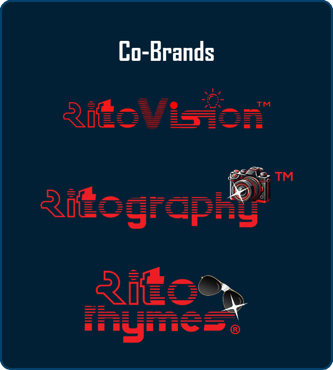
<div className={styles.logoArrayContainer}>
<h3 className={styles.logoArrayTitle}>Co-Brands</h3>
<nav
className={styles.logoArrayWrapper}
aria-label="Co-brand websites"
role="navigation"
>
<Link
href="https://ritovision.com"
target="_blank"
rel="noopener noreferrer"
className={styles.logoArrayLink}
aria-label="Visit Ritovision website (opens in new tab)"
>
<OrbImage
src="/images/brand/cobrands/ritovision-wordmark-tm.png"
alt="Ritovision"
width={250}
height={150}
fill={false}
className={`${styles.logoArrayImage} ${styles.ritovision}`}
/>
</Link>
{/* Additional logos follow the same pattern */}
</nav>
</div>
);
}Notice how each logo receives two classes: the general logoArrayImage class for shared behaviors and a specific class (like ritovision) for individualized sizing. The surrounding <nav> adds semantic structure and an aria-label for screen readers, while the aria-label on each link clarifies that the destination opens in a new tab.
The Science of Responsive Scaling
The component’s most sophisticated feature is its use of CSS clamp() functions for responsive scaling. Let me break down how this works and why it’s superior to traditional responsive approaches:
.ritovision {
    width: clamp(187px, 26.6vw, 293px);
}

.ritography {
    width: clamp(227px, 32vw, 347px);
}

.ritorhymes {
    width: clamp(147px, 21.3vw, 227px);
}
Each clamp() function defines three values: a minimum size, a preferred size, and a maximum size. Let’s decode what’s happening with the Ritovision logo as an example:
- Minimum (187px): Even on the smallest screens, the logo never shrinks below this size, ensuring it remains recognizable
- Preferred (26.6vw): The logo attempts to occupy 26.6% of the viewport width, allowing smooth scaling
- Maximum (293px): On large screens, the logo stops growing at this size to prevent it from becoming unnecessarily large
This approach creates a scaling behavior that feels natural across all device sizes. The logos grow and shrink proportionally with the viewport, but within carefully defined bounds that preserve their visual integrity.
Layout Transformation: Mobile to Desktop
The component implements a complete layout transformation between mobile and desktop views, not just a simple reflow:
.logoArrayContainer {
    display: flex;
    flex-direction: column;
    align-items: center;
    width: 100%;
    max-width: 300px;
    margin-top: 7%;
    padding: 5px 18px;
}

@media (min-width: 730px) {
    .logoArrayContainer {
        max-width: 1000px;  /* Dramatic width increase */
        padding: 5px 18px;
    }

    .logoArrayWrapper {
        flex-direction: row;  /* Switch from vertical to horizontal */
        justify-content: center;
        gap: 7%;  /* Percentage-based gap for proportional spacing */
    }
}
The container width jumps from 300px on mobile to 1000px on desktop—a more than 3x increase. This dramatic change reflects the different roles the component plays: on mobile, it’s a compact vertical list; on desktop, it’s an expansive horizontal showcase. The percentage-based gap (7%) ensures spacing between logos scales proportionally with the container size. On mobile, the gap uses 7vw, so the vertical spacing also scales with viewport width to prevent crowding small screens.
Interactive Enhancements
The component includes subtle but effective hover interactions that bring the static logos to life:
.logoArrayImage {
    transition: transform 1s ease-in-out;
}

.logoArrayImage:hover {
    transform: scale(1.1);
}
The 1-second transition duration might seem long for a hover effect, but it serves a specific purpose. The slow, smooth scaling creates a sense of importance and gravitas—these aren’t just clickable links, they’re gateways to entire brand experiences. The 10% scale increase is enough to indicate interactivity without disrupting the layout or causing adjacent logos to shift uncomfortably.
Customization for Different Use Cases
While the RitoSwap implementation showcases co-owned brands, this pattern adapts beautifully to various scenarios. Let me show you how to customize it for different needs:
Partner Logos
const partners = [
  {
    name: "Microsoft",
    href: "https://microsoft.com",
    src: "/images/partners/microsoft.png",
    widthClass: styles.microsoft,
  },
  {
    name: "Google Cloud",
    href: "https://cloud.google.com",
    src: "/images/partners/google-cloud.png",
    widthClass: styles.googleCloud,
  },
];
Certification Badges
<h3 className={styles.logoArrayTitle}>Certifications</h3>
// Display without links for non-clickable badges
<div className={styles.logoArrayImage}>
  <Image
    src="/images/certs/iso-27001.png"
    alt="ISO 27001 Certified"
    width={150}
    height={150}
  />
</div>
Client Showcase
// Add optional testimonial or case study links
<Link
  href="/case-studies/fortune-500-client"
  className={styles.logoArrayLink}
>
  <Image
    src="/images/clients/fortune-500-logo.png"
    alt="Fortune 500 Client"
    width={200}
    height={100}
    className={`${styles.logoArrayImage} ${styles.fortune500}`}
  />
</Link>
Scaling Strategies for Your Logos
When implementing the Logo Array for your own logos, you’ll need to calculate appropriate scaling values. Here’s a systematic approach:
- Analyze Logo Proportions: Measure each logo’s natural aspect ratio
- Determine Relative Importance: Decide which logos should appear larger
- Calculate Viewport Percentages: Use this formula:
Preferred percentage = (Desired relative size / Total logos) * 100 - Set Boundaries: Minimum should ensure readability, maximum should prevent oversizing
For example, if you have three logos and want them equally sized:
- Each gets approximately 33% of the container
- Account for gaps by reducing to about 28-30% each
- Adjust based on logo proportions
Performance Considerations
OrbImage wraps next/image and shows animated orbs while loading. By default it sets unoptimized={true}, so if you want the Next.js image pipeline (optimization, blur placeholders, priority) you must opt in:
<OrbImage
  src="/images/brand/cobrands/ritovision-wordmark-tm.png"
  alt="Ritovision"
  width={250}
  height={150}
  fill={false}
  unoptimized={false} // enable Next.js optimization
  priority           // mark above-the-fold
/>
For logo-heavy implementations, consider enabling unoptimized={false} only for above-the-fold logos and lazy loading the rest.
Accessibility and SEO Benefits
The component implements several accessibility best practices that deserve attention. Each logo uses descriptive alt text, and the surrounding <nav> gets an aria-label:
<OrbImage
  alt="Ritovision" // Clear, concise brand identification
  // ... other props
/>
The link structure with target="_blank" and rel="noopener noreferrer" ensures security while clearly indicating external navigation. For screen reader users, consider adding visually hidden text to provide context:
<Link href={url} className={styles.logoArrayLink}>
  <span className="sr-only">Visit {brandName} website</span>
  <OrbImage ... />
</Link>
Maintenance and Best Practices
When maintaining a Logo Array component, consistency is paramount. All logos should follow similar preparation guidelines:
- Consistent Backgrounds: Use transparent PNGs or ensure all logos have the same background treatment
- Padding Standards: Maintain consistent internal padding within logo files
- Color Considerations: In footer contexts, consider using monochrome or light versions for visual harmony
- File Optimization: Compress logos appropriately—they’re often viewed multiple times per session
Regular audits ensure all links remain active and logos stay current with brand updates. Nothing undermines credibility like displaying an outdated logo or linking to a defunct website.
Advanced Enhancement Possibilities
The Logo Array’s architecture opens doors for sophisticated enhancements. You might implement a carousel for extensive partner lists, showing a subset that rotates periodically. Animation sequences could create engaging entrance effects, with logos fading in sequentially as users scroll into view.
For dynamic implementations, the current LogoArrayServer is just a pass-through to the client component. You can evolve it to fetch logo configurations from a CMS or database, allowing non-technical team members to manage brand relationships without code changes. You could even implement conditional rendering based on user context—showing different partner logos for different geographic regions or user segments.
Conclusion
The Logo Array component represents a simple yet robust approach to visual storytelling through brand relationships. By combining intelligent scaling algorithms, responsive layout strategies, and thoughtful interaction design, it creates a showcase that respects individual brand identities while presenting a cohesive narrative about your organization’s ecosystem.
Whether you’re displaying subsidiary brands, celebrating partnerships, or showcasing your diverse portfolio, this component provides the technical foundation for presenting multiple logos with the sophistication they deserve. The careful attention to proportions, scaling, and responsive behavior ensures that every brand in your array receives appropriate attention and respect, regardless of the device or screen size viewing them.
Remember, in the footer of your application, the Logo Array serves as a final statement about your organization’s reach and relationships. Make it count by ensuring every logo appears at its best, every link works perfectly, and every interaction feels purposeful and polished.
Playground
Use the full Storybook UI to explore the logo array and tweak controls in real time.