Account Modal
- AccountModal.tsx
- AccountModal.module.css
Overview
The Account Modal serves as the central hub for wallet account management within the RitoSwap ecosystem. This modal component provides users with a comprehensive view of all connected accounts, their respective balances, and essential wallet management functions. As part of the Wallet UI modal collection, it offers an intuitive interface for viewing multiple connected addresses, monitoring native token balances across accounts, and accessing view-chain selection and disconnection capabilities.
Built on Wagmi v2’s multi-account capabilities, the Account Modal orchestrates complex account state management with live balance updates and ENS resolution. The component integrates deeply with RitoSwap’s Chain Info Provider system to display network-specific information and seamlessly transitions to the Network Modal for view-chain selection. This modal is primarily triggered by the AddressDisplay widget, creating a natural hierarchy from ambient account display to detailed account management — but any component that controls its isOpen and onClose props can open it. It reads the dapp chain state for balances and network labels. For the view-chain model, see Dapp Chain State.
Component Architecture
The Account Modal demonstrates sophisticated integration between Wagmi’s account management features and comprehensive wallet information display. The component creates a fixed-position overlay layer that renders above the main application content, ensuring consistent accessibility regardless of the triggering component’s position in the DOM hierarchy.
Triggering Mechanism
The Account Modal is typically triggered by the AddressDisplay widget, which serves as the primary visual indicator of the connected wallet state. When users click the AddressDisplay widget showing their truncated address or ENS name, it opens the Account Modal to reveal expanded account information:

// In AddressDisplay.tsx
const [isModalOpen, setIsModalOpen] = useState(false);

// Clicking the display opens the modal
<button onClick={() => setIsModalOpen(true)}>
  {/* Address or ENS name display */}
</button>

// Modal receives state through props
<AccountModal
  isOpen={isModalOpen}
  onClose={() => setIsModalOpen(false)}
/>
This architecture creates a clear interaction pattern where the always-visible AddressDisplay widget serves as both an ambient information display and the gateway to comprehensive account management features. Any other component can follow this same pattern to open the Account Modal by controlling its isOpen / onClose props.
Multi-Account Management
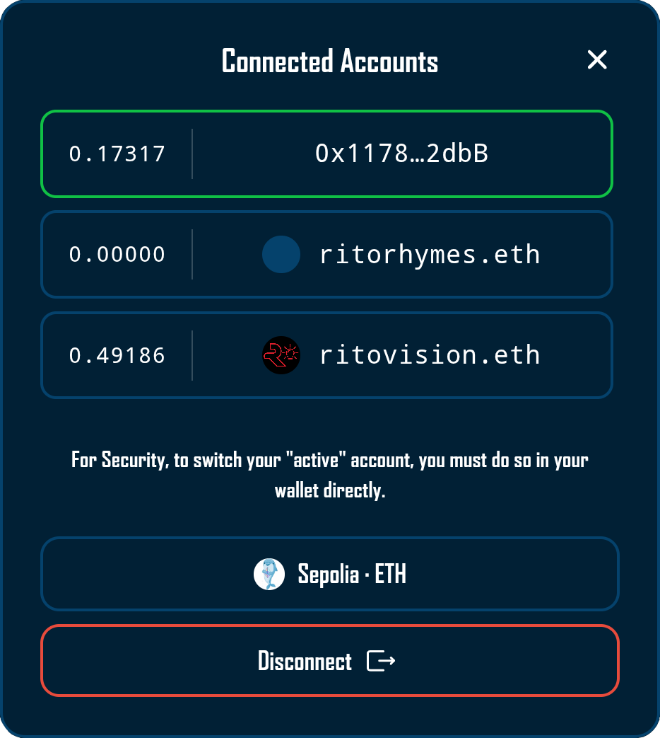
The Account Modal excels at handling Web3’s multi-account paradigm, where users may have multiple addresses connected simultaneously through their wallet provider. The component automatically detects all connected addresses through Wagmi’s useAccount hook and presents them in a scrollable list with individual balance information for each account.
The modal implements intelligent account sorting to enhance usability:
const sorted = [...addresses].sort((a, b) => {
  const al = a.toLowerCase();
  const bl = b.toLowerCase();
  const act = activeAddress?.toLowerCase() || "";
  if (al === act) return -1;
  if (bl === act) return 1;
  return 0;
});
This ensures the currently active account always appears at the top of the list, highlighted with a distinctive green border to provide immediate visual confirmation of which account will be used for transactions.
Account cards are intentionally read-only — clicking them does not change the active account. For security and consistency with wallet UX, users must always switch their active account inside the wallet interface itself.
Integration with Chain Info Provider
The Account Modal leverages the Chain Info Provider system to enhance network display with visual assets and user-friendly naming. The component accesses the Chain Info Provider through the useChainInfo hook:
const {
getChainLogoUrl,
getFallbackLogoUrl,
getChainDisplayName,
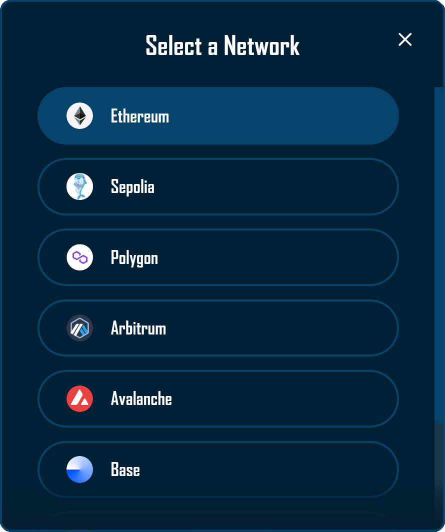
} = useChainInfo();This integration enables the modal to display the current view chain with its blockchain logo and normalized display name within the network button. The Chain Info Provider manages the complexity of CDN URL construction, special case handling for chains with non-standard naming conventions, and fallback logo provision when network assets are unavailable. For comprehensive documentation on the Chain Info Provider’s capabilities and configuration options, refer to the Chain Info Provider documentation.
Nested Modal Architecture
The Account Modal implements a sophisticated nested modal system that allows users to access view-chain selection without closing the account view. When users click the network button within the Account Modal, it opens the NetworkModal as a child overlay:
This nested approach requires careful z-index management and event handling to ensure proper layering and interaction behavior:
.overlay {
  z-index: 998; /* Below NetworkModal's backdrop (2000) */
}
The parent Account Modal suspends its backdrop click handling while the Network Modal is open, preventing accidental closure of both modals when users interact with the network selection interface.
Visual Design and Functionality
The Account Modal implements a comprehensive design that balances information density with visual clarity. The interface presents account information in a structured layout that adapts to different numbers of connected accounts while maintaining consistent visual hierarchy.
Account Display Cards
Each connected account renders as a distinct card within the scrollable list, displaying critical information in a scannable format:
- Balance Display: Native token balance shown with up to 6 total digits of precision (including decimals), dynamically adjusted based on the integer portion length
- Visual Separator: A subtle divider line separates the balance from the address information
- Address Information: Shows either the ENS name (truncated if necessary) or the standard truncated address format
- ENS Avatar: When available, displays the ENS avatar image to the left of the address
The balance symbol displayed next to the value comes directly from Wagmi’s useBalance hook for the selected view chain’s native token.
Active accounts receive special visual treatment through a green border color that matches RitoSwap’s utility color palette, creating immediate recognition of the account that will be used for transactions.
Balance Formatting Logic
The modal implements intelligent balance formatting that optimizes readability while maintaining precision:
const raw = parseFloat(formatUnits(balance.value, balance.decimals));
const intLen = Math.floor(raw).toString().length;
const fracDigits = Math.max(0, 6 - intLen);
balanceDisplay = raw.toFixed(fracDigits);
This algorithm ensures that smaller balances display with more decimal precision while larger balances show fewer decimals to prevent overflow, maintaining a consistent visual width across different balance magnitudes.
Interaction Patterns
The modal supports multiple dismissal methods to accommodate different user preferences and device types:
Click Outside: Users can tap the backdrop area to close the modal, following standard modal interaction patterns.
Close Button: A prominent × button in the top-right corner provides explicit dismissal control.
Escape Key: Desktop users can press the Escape key to quickly close the modal.
Swipe Gesture: On touch devices, users can swipe left to dismiss the modal, enhancing mobile usability:
const swipeHandlers = useSwipeable({
  onSwipedLeft: () => onClose(),
  preventScrollOnSwipe: true,
  trackTouch: true,
  trackMouse: false,
  delta: { left: 50 },
  swipeDuration: 300,
});
Contextual Messaging
The modal provides context-sensitive messages based on the number of connected accounts:
- Multiple Accounts: Displays a security notice explaining that account switching must be performed within the wallet interface, not the dApp
- Single Account: Shows a simple message indicating only one account is connected
This adaptive messaging helps users understand the limitations of Web3 account management while providing appropriate guidance for their specific situation.
Technical Implementation
Wagmi v2 Hook Integration
The Account Modal leverages essential Wagmi v2 hooks to manage account information and state:
useAccount provides the complete list of connected addresses and identifies the currently active account. The hook’s addresses array contains all connected accounts, while the address property indicates which account is currently selected for transactions.
useDisconnect supplies the disconnection functionality through its disconnect method. This function cleanly terminates the wallet connection and triggers appropriate state cleanup throughout the application.
useDappChain provides the view-chain identifier, used to determine the correct native token symbol and integrate with the Chain Info Provider for network display.
useBalance fetches live balance information for each connected account on the selected view chain. The hook is called multiple times within the AccountItem subcomponent, once for each address in the list.
useEnsName and useEnsAvatar provide ENS resolution capabilities for each account. These hooks always query Ethereum mainnet (chainId: 1) regardless of the current network, maintaining consistency with ENS deployment.
State Management and Effects
The modal manages several state variables to coordinate its complex behavior:
const [showNetworkModal, setShowNetworkModal] = useState(false);This state controls the nested Network Modal display, enabling the sophisticated modal-within-modal interaction pattern.
The component implements multiple effect hooks for proper cleanup and interaction handling:
// Click outside handler with network modal awareness
useEffect(() => {
  if (!isOpen || showNetworkModal) return;
  const handleClickOutside = (e: MouseEvent) => {
    if (modalRef.current && !modalRef.current.contains(e.target as Node)) {
      onClose();
    }
  };
  document.addEventListener("mousedown", handleClickOutside);
  return () => document.removeEventListener("mousedown", handleClickOutside);
}, [isOpen, onClose, showNetworkModal]);
This effect demonstrates the careful coordination required for nested modals, disabling backdrop clicks when the Network Modal is open to prevent unintended interactions.
The component also manages focus when the modal opens, moving focus to the first interactive element inside the dialog to support keyboard users.
Native Token Resolution
The modal maintains a mapping of chain IDs to native token symbols, with fallback to the chain’s configured native currency:
const NATIVE_TOKENS: { [chainId: number]: string } = {
  1: "ETH",
  137: "MATIC",
  42161: "ETH",
};

const nativeSymbol =
  NATIVE_TOKENS[dappChainId] ?? dappChain?.nativeCurrency.symbol ?? "ETH";
This approach ensures accurate token symbols for well-known networks while gracefully handling custom or lesser-known chains through Wagmi’s chain configuration. The resulting nativeSymbol is surfaced in the network button label alongside the chain’s display name.
Props Reference
| Prop | Type | Required | Description |
|---|---|---|---|
isOpen | boolean | Yes | Controls the modal’s visibility. When true, the modal renders with animation. When false, the modal unmounts from the DOM. |
onClose | () => void | Yes | Callback function invoked when the modal should close. Called on backdrop click, close button click, Escape key press, swipe gesture, or after disconnection. |
CSS Architecture
The modal’s styling architecture creates a sophisticated visual experience with careful attention to layout, animation, and responsive behavior.
Overlay and Modal Structure
The backdrop creates a semi-transparent overlay with backdrop blur, focusing user attention on the modal content:
.overlay {
  position: fixed;
  top: 0;
  left: 0;
  right: 0;
  bottom: 0;
  background-color: rgba(0, 0, 0, 0.5);
  backdrop-filter: blur(20px);
  -webkit-backdrop-filter: blur(20px);
  z-index: 998;
  animation: fadeIn 0.2s ease-out;
}
The z-index value of 998 is specifically chosen to sit below the Network Modal’s backdrop (2000), enabling the nested modal functionality while maintaining proper visual layering.
Animation System
The modal implements multiple animation effects for different UI elements:
@keyframes slideIn {
  from {
    opacity: 0;
    transform: translateY(-20px);
  }
  to {
    opacity: 1;
    transform: translateY(0);
  }
}
The disconnect button features a particularly sophisticated hover animation that extends an arrow icon:
.disconnectButton:hover .arrowLine {
  transform: translateX(2px);
}

.disconnectButton:hover .arrowExtension {
  opacity: 1;
}

.disconnectButton:hover .arrowHead {
  transform: translateX(4px);
}
This creates a dynamic effect suggesting the “exit” action of disconnection.
Scrollable Account List
The account list implements custom scrollbar styling and maximum height constraints:
.accountList {
  max-height: calc(4 * 56px + 3 * 8px);
  overflow-y: auto;
}

.accountList::-webkit-scrollbar {
  width: 6px;
}

.accountList::-webkit-scrollbar-thumb {
  background: var(--secondary-color);
  border-radius: 3px;
}
The calculated maximum height shows up to 4 accounts before scrolling, maintaining a compact modal size while accommodating users with many connected addresses.
Responsive Design
The modal adapts to mobile viewports with adjusted spacing and sizing:
@media (max-width: 480px) {
  .modal {
    padding: 20px;
    min-width: 280px;
  }

  .accountButton {
    min-height: 48px;
  }

  .balance {
    min-width: 75px;
    font-size: 13px;
  }
}
These adjustments ensure the modal remains usable on smaller screens while maintaining its information hierarchy.
Accessibility
The Account Modal includes several accessibility features:
- The dialog container uses
role="dialog"witharia-modal="true", and programmatically moves focus to the first interactive element when opened. - The account list is exposed as a
radiogroupwith each account button marked asrole="radio"andaria-checkedto indicate the active account. - Contextual messages about single vs multiple accounts are announced via
role="status", helping assistive technology users understand the current connection state.
These patterns ensure that keyboard and screen reader users can navigate the modal effectively.
Usage Examples
Basic Implementation with AddressDisplay
import AddressDisplay from '@/components/wallet/addressDisplay/AddressDisplay';
import AccountModal from '@/components/wallet/accountModal/AccountModal';

function WalletInterface() {
  const [isAccountModalOpen, setIsAccountModalOpen] = useState(false);

  return (
    <>
      <div onClick={() => setIsAccountModalOpen(true)}>
        <AddressDisplay />
      </div>

      <AccountModal
        isOpen={isAccountModalOpen}
        onClose={() => setIsAccountModalOpen(false)}
      />
    </>
  );
}
Integration with Custom Triggers
// Any component can trigger the modal
function CustomAccountTrigger() {
  const [showModal, setShowModal] = useState(false);
  const { address } = useAccount();

  return (
    <>
      <button
        onClick={() => setShowModal(true)}
        className={styles.customTrigger}
      >
        Manage Accounts ({address ? '1 connected' : 'Not connected'})
      </button>

      <AccountModal
        isOpen={showModal}
        onClose={() => setShowModal(false)}
      />
    </>
  );
}
Best Practices
When implementing the Account Modal, ensure proper state management in the parent component. The modal itself is stateless regarding its visibility, relying entirely on props for display control. This makes it predictable and easy to test while allowing flexible integration patterns.
Consider the modal’s nested architecture when implementing custom wallet interfaces. The ability to open the Network Modal from within the Account Modal creates a powerful interaction pattern but requires careful attention to z-index layering and event propagation.
Monitor performance when dealing with many connected accounts. While the modal handles multiple addresses efficiently through a compact scrollable list and hook-based balance fetching, extremely large numbers of accounts may benefit from pagination or filtering mechanisms.
For applications supporting hardware wallets or other multi-account providers, provide clear user education about the security model. The modal’s messaging about account switching helps, but additional context in your application’s documentation can prevent user confusion about why they cannot switch accounts directly within the dApp interface.
The Account Modal’s balance display automatically adjusts decimal precision based on the magnitude of the balance. This intelligent formatting ensures that users with small balances see sufficient precision for decision-making, while large balance holders aren’t overwhelmed with unnecessary decimal places. The maximum of 6 total digits (including decimals) maintains consistent visual alignment across all balance ranges.
Playground
Use the full Storybook UI to explore the modal states and tweak controls in real time.