Connect Modal
- ConnectModal.tsx
- WalletModalHost.tsx
- connectModalBridge.ts
- ModalWrapper.tsx
- WalletButton.tsx
- useWalletConnection.ts
- useFocusTrap.ts
- useAutoCloseOnRoute.ts
- useSwipeToClose.ts
- DefaultView.tsx
- MobileWalletsView.tsx
- QrView.tsx
- ConnectingView.tsx
- ErrorView.tsx
- CanceledView.tsx
- GetWalletView.tsx
Overview
The Connect Modal is the entry-point experience for any wallet connection inside RitoSwap. It centralizes connector discovery, WalletConnect QR flows, mobile deep-linking, and error recovery behind a single surface that can be summoned from anywhere—navigation, widgets, automation, or programmatic workflows. The system is composed of discrete layers for triggers, modal chrome, state management, and view rendering so each part can evolve without duplicating connection logic.
What this system provides
- Automatic Wagmi/EIP-6963 connector ordering with brand metadata and default fallbacks.
- A dedicated state machine with typed states (
default,mobile-wallets,walletconnect-qr,connecting,error,canceled,get-wallet) that drives every view. - A singleton opener bridge so only one modal instance exists, yet any feature can request it.
- Mobile-first gestures, a lazy-loaded WalletConnect wallet chooser, chooser-scoped deep linking, and desktop niceties (focus trap, Escape, portal rendering).
- Built-in a11y affordances:
role="dialog", labelled regions per view, polite live regions for status updates, and route-change cleanup.
Architecture at a glance
Trigger & hosting surfaces
The system intentionally separates who asks for the modal from how the modal behaves:
ConnectState.tsx(documented on the ConnectButton page) renders the CTA and callsopenWalletConnectModal()on click.connectModalBridge.tsexportsopenWalletConnectModal()plusregisterWalletConnectOpener()/useRegisterWalletConnectOpener(). Only one opener exists at a time, and the most recently registered handler wins.WalletModalHost.tsxmounts near the app root and registers an opener during bootstrap. If another surface later registers and then unmounts, no fallback is automatically restored, so keep at least one opener mounted to keepopenWalletConnectModal()functional.

This split keeps modal orchestration reusable without duplicating Wagmi awareness in every surface.
Modal shell & platform hooks
ConnectModal.tsx focuses on viewport management and a11y:
- Creates a portal attached to
document.body, adds a semantic backdrop, and wraps children withModalWrapper(role="dialog",aria-modal, and optionalaria-labelledby). - Installs effect-driven helpers:
useAutoCloseOnRoutecloses the modal if Next.js navigation changes while the modal is open.useFocusTraptraps Tab/Shift+Tab, captures the previously focused element, and restores focus after close. It also listens forEscape.useSwipeToClosewires left-swipe gestures (50px threshold) for touch users.
- Observes Wagmi’s
useAccountstate so an in-flightconnectingstate automatically closes the dialog once the user is connected.
Modal chrome classes (styles/ModalWrapper.module.css) expose two size presets (modal vs modalLoading) to visually differentiate list views from loading/error surfaces.
Connection state machine
useWalletConnection.ts is the heart of the system. It encapsulates everything the modal needs to render meaningful UI without exposing Wagmi primitives to the component tree.
State & data
ui.state:"default" | "mobile-wallets" | "walletconnect-qr" | "connecting" | "error" | "canceled" | "get-wallet".ui.qrUri: WalletConnect URI, propagated to both the QR view and mobile deep-link openers.ui.copied: toggles the “Copy to clipboard” CTA label for two seconds.ui.connectingWallet:{ name, icon, isWalletConnect }, so every view (connecting/error/canceled) can show accurate branding even if connectors lack icons.ui.mobileWalletsStatus,ui.mobileWalletFilter,ui.selectedMobileWallet, andui.lastUsedMobileWalletdrive the chooser screen and chooser memory.- Internal guards:
pendingConnectorprevents double-click races, whileabortConnection()resets UI state and only resets wagmi when we are not mid-connection.
Transitions
-
Connector click (
actions.handleConnectorClick):- Injected wallets set
connectingWallet, move toconnecting, and awaitconnectAsync. If called again while pending, the state just re-entersconnectingfor clarity. - The regular WalletConnect button stays generic: desktop users get the QR view, while mobile users get redirected immediately to the raw WalletConnect URI when
display_uriarrives. - The
Choose Mobile Walletsbranch lazy-loads WalletConnect Explorer wallets on first open, caches the explorer response for the page session, filters to EVM-compatible mobile wallets, and launches the selected wallet’s native/universal link whendisplay_uriarrives. The mobile intent behind those two choices is deliberate: the regular WalletConnect button is the Android-oriented default because Android wallets usually handle raw WalletConnect deeplinks and intents correctly, whileChoose Mobile Walletsexists mainly for iPhone flows that need wallet-specific universal links. Android can still use the chooser, but it is usually optional there.
- Injected wallets set
-
Success resets pending state and returns to
default.ConnectModalthen closes whenuseAccount().isConnectedflips true. -
Errors inspect the message to distinguish “User rejected” (canceled) from everything else (error). Generic flows return to
default; chooser-started flows return tomobile-walletsafter 1.5 seconds. -
Actions exposed to views:
backToDefault()clears QR state and terms view.cancelConnecting()callsabortConnection()to clear UI state and only resets wagmi when the user is not mid-approval.copyQr()writes to the clipboard and manages the success toast label.openWallet()navigates to the currentqrUri, preferring the chooser-selected wallet launcher when the flow started fromChoose Mobile Wallets.
Because the hook owns connector ordering (injected first, WalletConnect last), DefaultView can stay dumb and simply render data.allConnectors.
View surfaces
Each view lives in views/ with its own CSS module so we can iterate on layout or animation independently:
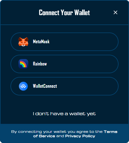
DefaultView
Shows the brand logo, wallet list (WalletButton entries with accessible labels), a mobile-only Choose Mobile Wallets entry beneath the normal WalletConnect option, and the “I don’t have a wallet” CTA leading to Get Wallet view. Terms copy is outside the scroll region so it stays visible on small heights.
On mobile, think of the two WalletConnect entries as different platform tools: the regular WalletConnect row is the generic Android-friendly path, while Choose Mobile Wallets is the iPhone-friendly universal-link path.
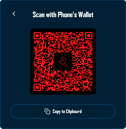
QrView
Renders a placeholder until qrUri arrives, then swaps to react-qr-code. The QR canvas uses custom colors, embeds the Rito logo, and offers a copy-to-clipboard CTA with aria-label feedback.
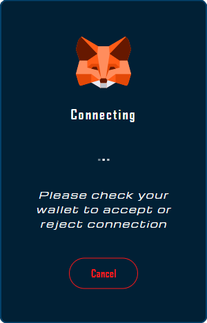
ConnectingView
Loops animated dots, shows wallet brand art, surfaces a Cancel button, and conditionally exposes Open Wallet or Open <Wallet Name> when a WalletConnect URI exists on mobile. Status text uses role="status" + aria-live="polite".
MobileWalletsView
Renders the chooser-specific WalletConnect screen. The explorer list is fetched lazily, shown as a scrollable wallet grid, and filtered live from a fixed footer field. While the filter input is focused, the chooser content height is locked so the virtual keyboard does not cause the modal to jump around.
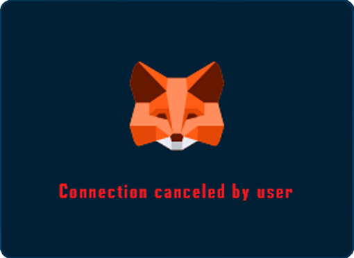
ErrorView & CanceledView
Share the loading layout but change the copy so analytics can distinguish failures from user-initiated cancellations. role="alert" communicates urgency to assistive tech.

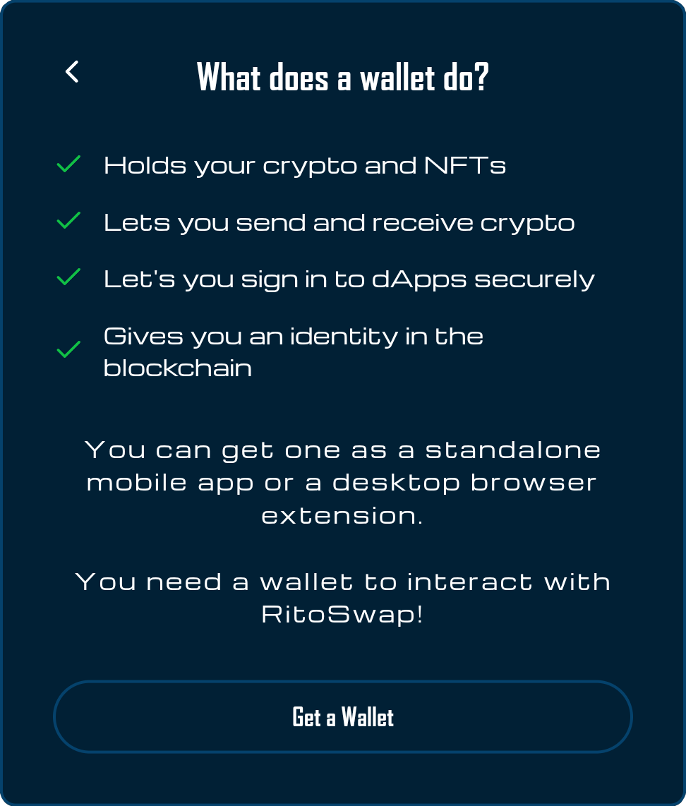
GetWalletView
Educational panel with checklist items, each treated as role="listitem", plus an external link to Ethereum’s wallet finder that opens in a new tab.
Drop-in styles in styles/ConnectingStates.module.css, styles/QrView.module.css, etc., keep animation and layout logic isolated from React code.
Playground
Use the full Storybook UI to explore the modal states and tweak controls in real time.
Accessibility & interaction contract
Even though the modal is manually assembled, it ships with a robust ARIA story:
ModalWrappersetsrole="dialog",aria-modal="true", and takes an optionalaria-labelledbyso headings describe the surface when applicable.useFocusTrapcaptures the previously focused element, loops focus inside the modal, and responds toEscape.- Every view defines its own labelled region (
role="region"+ heading IDs) or status role to ensure screen reader announcements are meaningful. - Live feedback is provided through polite regions (connecting text) or alerts (errors). The QR placeholder announces “Generating QR Code…” until data is ready.
- Touch gestures are optional: swipe left to close, backdrop click to close, Cancel button, Escape key, or programmatic
onClose. useAutoCloseOnRouteguarantees we never strand the dialog when client-side routing occurs (e.g., nav clicks, app-level redirects).
Call out these guarantees when coordinating with a11y reviewers so regressions can be caught during PR review rather than exploratory testing.
Usage patterns
Basic embedding
import ConnectModal from '@/components/wallet/connectModal/ConnectModal';

function Page() {
  const [open, setOpen] = useState(false);

  return (
    <>
      <button onClick={() => setOpen(true)}>Connect</button>
      <ConnectModal isOpen={open} onClose={() => setOpen(false)} />
    </>
  );
}
Use this pattern sparingly—most product surfaces should rely on ConnectState (from ConnectButton) so the CTA and modal feel identical everywhere. Still, having a direct embed API helps testing, storybook usage, or bespoke admin screens.
Programmatic opening
import { openWalletConnectModal } from '@/components/wallet/connectModal/connectModalBridge';

export function RequireWalletGate({ children }) {
  const { isConnected } = useAccount();

  if (!isConnected) {
    return (
      <button onClick={() => openWalletConnectModal()}>
        Connect to use this feature
      </button>
    );
  }

  return children;
}
Any module can import openWalletConnectModal() as long as an opener is registered (usually via WalletModalHost or useRegisterWalletConnectOpener). If no opener has registered yet, the bridge retries up to five zero-delay timeouts before giving up silently.
Always-available host
Add WalletModalHost near the app root (before layout children) so an opener exists during initial load. If some other trigger later registers and then unmounts, you must re-register a handler (e.g., by keeping ConnectState mounted in a hidden container or by toggling a keyed WalletModalHost) because the host does not automatically reclaim ownership.
// dapp/app/layout.tsx
export default function RootLayout({ children }) {
  return (
    <html lang="en">
      <body>
        <WalletModalHost />
        {children}
      </body>
    </html>
  );
}
This host integrates with the bridge automatically so QA scripts, LI.FI widgets, or form gates have an opener during boot. If those flows run after another trigger unregisters, make sure you re-register an opener (mount ConnectState, remount the host, or call useRegisterWalletConnectOpener from the relevant surface) before invoking openWalletConnectModal().
Scope & related docs
- The ConnectButton documentation covers the disconnected-state widget, variant contract, and how
ConnectStatetriggers the modal. - The Disconnect widget describes the connected-state CTA that hands users a way out after the modal succeeds. Reference it whenever you mention wallet lifecycle handoffs.
- Use this Connect Modal page for everything that happens inside the modal shell—state machine behavior, explorer chooser behavior, view details, bridge APIs, and accessibility rules. Avoid duplicating Wagmi primer content; instead link to the Wagmi or WalletConnect resources if engineers need protocol-level depth.
Need to extend the modal? Add new state-machine transitions or views next to the existing ones, document the motivation here, and circulate the update to product and a11y reviewers before merging so we keep the UX consistent across every wallet entry point.