Organization & Layout Components
The organization layer provides the structural foundation for the portfolio UI, implementing a hierarchical display system that prevents information overload while maintaining quick access to all assets. These components orchestrate the presentation of multi-chain portfolios through nested accordions and intelligent state management.
Architectural Overview
The organization system implements a multi-level hierarchy that provides progressive disclosure of portfolio information. The PortfolioClient component serves as the top-level orchestrator, managing selection state and coordinating between selection components and the display hierarchy. Below this, ChainWrapper manages the overall portfolio display and handles empty states. The middle level consists of ChainAccordion components that group assets by blockchain network. The bottom level uses TokenAccordion components to further organize assets by token type within each chain.
This hierarchical approach solves several critical user experience challenges. It prevents overwhelming users with thousands of assets displayed simultaneously, enables quick navigation to specific blockchain networks or token types, provides visual grouping that aids in mental organization of assets, and maintains performance by lazy-loading content only when requested.
- ChainWrapper.tsx
- ChainAccordion.tsx
- TokenAccordion.tsx
- Placeholder.tsx
PortfolioClient Component
The PortfolioClient component acts as the top-level orchestrator for the entire portfolio interface. It manages the critical state that flows through all organization and display components, specifically tracking the selected wallet account, selected blockchain networks, and selected token types. This centralized state management ensures consistent data flow and enables coordinated updates across the component hierarchy.
The component wraps its content in a ChainInfoProvider, establishing the context necessary for blockchain-specific display logic throughout the portfolio UI. It then renders three primary sections: account selection at the top, chain and token selection controls in the middle, and the ChainWrapper display component at the bottom. This layout reflects the logical flow of portfolio exploration, where users first select an account, then configure what they want to see, and finally view their assets.
The internal Content component handles the transformation of selection state into the ChainData format required by ChainWrapper. This separation allows for isolated testing of the mapping logic while maintaining clean component boundaries. The transformation combines selected chain IDs with display names and propagates token type selections to each chain, creating the structured data necessary for hierarchical display.
ChainWrapper Component
The ChainWrapper component serves as the orchestration layer for the entire portfolio display. It manages the high-level state transitions between empty and populated portfolio views while coordinating the animation of multiple blockchain accordions.
State Management Philosophy
The component implements a clear state management strategy based on two critical conditions: wallet connection status and chain selection status. This dual-condition approach ensures users receive appropriate guidance at each step of the portfolio setup process.
The component determines display state through straightforward boolean logic that checks whether a wallet address exists and whether any blockchain networks have been selected. This approach provides clear, predictable behavior that users can easily understand.
const isWalletConnected = address && address !== ''
const hasChainsSelected = chains && chains.length > 0
const showPlaceholder = !isWalletConnected || !hasChainsSelected
Animation Orchestration
ChainWrapper implements sophisticated animation orchestration using Framer Motion’s AnimatePresence component. The animation system provides smooth transitions between placeholder and content states, ensuring visual continuity as users progress through portfolio setup.
The component uses a multi-layered animation approach. The outer content wrapper fades in over 0.5 seconds, while inner chain accordions implement a staggered animation with a 1-second duration and cascading delays. The AnimatePresence component uses mode="popLayout" to coordinate layout transitions when chains are added or removed.
// Outer content fade-in
<motion.div
  initial={{ opacity: 0 }}
  animate={{ opacity: 1 }}
  transition={{ duration: 0.5 }}
>
  <AnimatePresence mode="popLayout">
    {/* Inner chain accordions with stagger */}
    <motion.div
      key={c.chainId}
      layout
      initial={{ opacity: 0, y: 20 }}
      animate={{ opacity: 1, y: 0 }}
      exit={{ opacity: 0, y: -20 }}
      transition={{
        duration: 1,
        delay: index * 0.1,
        ease: 'easeInOut'
      }}
    >
Data Flow Integration
ChainWrapper receives a fully structured ChainData[] payload from the PortfolioClient Content helper. That mapping layer combines each selected chain ID with its display name from useChainInfo, attaches the shared token-type selections, and forwards the active wallet address. ChainWrapper itself simply iterates over this normalized data to render ChainAccordion instances, keeping the container free of extra transformation logic.
The ChainWrapper component maintains no internal state, following React best practices for container components. All state management occurs at the PortfolioClient level, ensuring predictable data flow and easier testing.
ChainAccordion Component
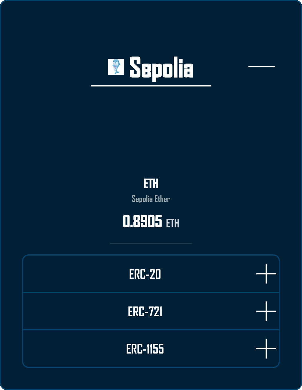
The ChainAccordion component provides the blockchain-level organization, presenting each network as an expandable section containing native balance information and token type accordions.
Visual Hierarchy Design
The component creates a clear visual hierarchy through careful composition of elements. The accordion header displays the blockchain logo and name prominently, providing immediate network identification. The expanded content area shows the native currency balance centered for emphasis, followed by token type accordions for detailed asset exploration.
This design philosophy ensures users can quickly scan available networks while maintaining access to detailed information through progressive disclosure.
Integration with BigAccordion
The component leverages a shared BigAccordion utility component that provides consistent accordion behavior across the application. This integration ensures uniform interaction patterns while allowing for chain-specific customization.
The title element composition demonstrates the component’s attention to visual detail. By combining blockchain logos with display names, the component provides both visual and textual network identification, accommodating different user preferences and accessibility needs.
const titleElement = (
  <div style={{ display: 'flex', alignItems: 'center' }}>
    <img
      src={logoUrl}
      alt=""
      aria-hidden="true"
      style={{ width: 24, height: 24, marginRight: '0.5rem' }}
    />
    <span>{chainName}</span>
  </div>
)
Native Balance Integration
Each chain accordion prominently displays the native currency balance, providing immediate insight into gas availability. The integration with the NativeBalance component ensures real-time updates as blockchain state changes, maintaining data accuracy throughout the user session.
The centered placement of native balance information reflects its importance in the blockchain ecosystem. Users need quick access to gas token balances for transaction execution, making this prominent placement a critical usability feature.
TokenAccordion Component
The TokenAccordion component implements the deepest level of organization, grouping assets by token type within each blockchain. This component demonstrates advanced React patterns including lazy loading, prefetching, and animated content transitions.
Lazy Loading Architecture
The component implements true lazy loading where accordion content only mounts when opened. This architecture provides significant performance benefits by deferring expensive asset queries until needed, reducing initial page load time and memory consumption.
The implementation uses AnimatePresence with conditional rendering to achieve lazy loading while maintaining smooth animations. Content components mount and unmount based on accordion state, ensuring optimal resource utilization.
<AnimatePresence initial={false}>
  {isOpen && (
    <motion.div
      key="content"
      className={styles.contentWrapper}
      initial="collapsed"
      animate="open"
      exit="collapsed"
      variants={{
        open: { height: 'auto', opacity: 1 },
        collapsed: { height: 0, opacity: 0 },
      }}
    >
      <TokenAccordionContent
        chainId={chainId}
        tokenType={tokenType}
        address={address}
      />
    </motion.div>
  )}
</AnimatePresence>
Prefetching Strategy
The component implements an intelligent prefetching system that loads data on hover, anticipating user intent. This optimization improves perceived performance by eliminating loading delays when users open accordions.
The prefetching logic operates through a separate TokenItem component that maintains its own connection to the useAssets hook. This architecture ensures each token type can independently manage its prefetching behavior without affecting others.
Multi-Accordion Management
The TokenAccordion supports multiple simultaneous open sections through Radix UI’s Accordion primitive. This design choice reflects user research indicating that portfolio explorers often compare assets across token types.
The component maintains an array of open accordion values, allowing flexible state management. Users can open multiple token type sections simultaneously, facilitating cross-type asset comparison and exploration.
Animation System
The component implements a sophisticated animation system that provides visual feedback for all interactions. The custom rotation animations for accordion indicators create intuitive open/close states. The height-based content animations ensure smooth transitions without layout jumps.
The animation timing carefully balances responsiveness with visual polish. Transitions complete within 300 milliseconds, providing immediate feedback while maintaining smooth visual flow.
Placeholder Component
The Placeholder component provides critical user guidance when the portfolio is ready for the user to input information to display assets, but may not be aware of what’s required to initiate this. This component demonstrates thoughtful empty state design that guides users toward successful portfolio setup.

User Guidance Philosophy
The placeholder message directly addresses the two requirements for portfolio display: wallet connection and blockchain selection. This clear communication prevents user confusion and provides actionable next steps.
The component uses prominent typography and centered layout to ensure the message captures user attention. The fade-in animation prevents jarring appearance while maintaining visual hierarchy within the application.
Animation Integration
The Placeholder component participates in the ChainWrapper’s animation orchestration through Framer Motion. The component fades in smoothly when no portfolio data exists and fades out when users complete the required setup steps.
This animation integration ensures seamless transitions between application states, maintaining visual continuity throughout the user journey.
Interaction Patterns
The organization components implement consistent interaction patterns that users can learn once and apply throughout the portfolio interface.
Accordion Interactions
All accordions in the system follow consistent interaction patterns. Click interactions toggle accordion state with immediate visual feedback. Hover states indicate interactive elements and trigger prefetching where applicable. Keyboard navigation supports accessibility with Tab and Enter key support.
These consistent patterns reduce cognitive load by ensuring users can predict component behavior across different contexts.
State Persistence
State is intentionally scoped to the component that owns it. TokenAccordion stores open sections in a local array, so those selections persist while the component stays mounted but reset whenever its parent removes and re-adds the chain (for example, when a user deselects a network or switches wallets). ChainAccordion relies on the shared BigAccordion utility, which keeps headers open until that section unmounts; connecting to a different wallet alone does not alter which chains are expanded unless the selection list changes.
Performance Considerations
The organization layer implements several performance optimizations that ensure smooth operation even with large portfolios.
Component Mounting Strategy
The lazy mounting approach significantly reduces initial render time. By deferring TokenAccordionContent mounting until accordion opening, the system avoids unnecessary API calls and component initialization for unopened sections.
Animation Performance
ChainWrapper leans on opacity and translate animations for its fade-and-slide transitions, which keep GPU acceleration engaged. TokenAccordion, however, animates height between 0 and auto to achieve the familiar accordion collapse. That choice incurs layout work, but it prioritizes readable content reveal over absolute animation efficiency. The staggered animation approach for multiple chain accordions prevents simultaneous heavy renders, spreading the computational load across multiple frames for smoother performance.
Memory Management
The organize components avoid manual event listeners entirely, instead relying on declarative hooks (React Query, Framer Motion, Radix) that manage their own subscriptions and abort pending work on unmount. Because there are no custom useEffect handlers, unmounting is handled by the framework without additional cleanup code.
Accessibility Implementation
The organization components implement comprehensive ARIA attributes and keyboard navigation support to ensure accessibility.
ARIA Attributes
Each accordion implements proper ARIA attributes including aria-expanded for state indication, aria-controls for relationship mapping, and aria-labelledby for accessible names. These attributes ensure screen reader users can navigate the portfolio structure effectively.
Keyboard Navigation
The components leverage Radix UI’s built-in keyboard navigation support, which provides standard accordion interaction patterns. Tab key navigation moves between interactive elements, allowing users to navigate through accordion headers sequentially. Enter or Space keys activate accordion triggers to expand or collapse sections. Arrow keys navigate between accordion items within a group when using Radix UI’s Accordion component. This keyboard support ensures basic accessibility compliance without requiring custom implementation.
Focus Management
The system relies on Radix UI’s default focus management behavior, which maintains focus on accordion triggers after activation. This allows users to continue navigating through accordion headers after expanding or collapsing sections. The framework handles basic focus visibility and ensures interactive elements remain keyboard accessible throughout the user journey.
Testing Coverage
The organization components include unit tests for individual component behavior and a limited integration test that verifies the overall component structure.
Integration Testing
The PortfolioClient integration test verifies that all major components render within the ChainInfoProvider context. This test ensures the basic component hierarchy renders correctly, with SelectAccount, SelectChain, SelectToken, and ChainWrapper components all mounting successfully within the provider wrapper. The test validates the structural integrity of the component tree but does not exercise the full user workflow or state transitions.
// PortfolioClient.integration.test.tsx
describe('<PortfolioClient /> integration under ChainInfoProvider', () => {
  it('renders all sub-components inside ChainInfoProvider', () => {
    render(<PortfolioClient />)
    // Ensure we're wrapped in the new provider
    expect(screen.getByTestId('chain-info-provider')).toBeInTheDocument()
    // And all children render as before
    expect(screen.getByTestId('acct')).toBeInTheDocument()
    expect(screen.getByTestId('chain-select')).toBeInTheDocument()
    expect(screen.getByTestId('token-select')).toBeInTheDocument()
    expect(screen.getByTestId('chain-wrapper')).toBeInTheDocument()
  })
})
Unit Testing
Each organization component has corresponding unit tests that verify core functionality including proper rendering with various prop combinations, state management behavior, and event handler execution. These tests use mocked dependencies to isolate component behavior and ensure predictable test execution. While the components implement comprehensive ARIA attributes for accessibility, these implementations are not covered by automated accessibility testing.
Best Practices and Guidelines
When working with organization components, follow these established patterns for optimal results.
Component Composition
Maintain clear separation between organization and display logic. Organization components should focus on layout and state management without concerning themselves with asset display details. Use composition patterns to combine components flexibly while maintaining single responsibility principles.
Animation Guidelines
Keep animations subtle and purposeful, avoiding excessive motion that might distract from content. Ensure all animations respect user preferences for reduced motion. Test animations on lower-powered devices to ensure acceptable performance across all target platforms.
State Management
Lift state to the appropriate level based on component needs. Portfolio-wide state belongs in PortfolioClient, while accordion-specific state can remain local. Avoid prop drilling by using context where appropriate for deeply nested components.
Playground
Use the full Storybook UI to explore the organization layout and tweak controls in real time.