AddressDisplay Widget
- AddressDisplay.tsx
- AddressDisplay.module.css
Overview
The AddressDisplay widget serves as the primary visual identifier for connected wallet accounts within the RitoSwap interface. As part of the Wallet UI widget collection, it provides users with immediate recognition of their connected address while supporting enhanced identity features through ENS (Ethereum Name Service) integration. This widget represents one of the core connected-state components that automatically appears when a wallet connection is established.

Built on Wagmi v2’s robust hook system, AddressDisplay orchestrates multiple data sources to create a sophisticated yet performant display component. The widget seamlessly transitions between showing truncated addresses and ENS names when available, complete with avatar support for wallets that have configured ENS profile images. This progressive enhancement approach ensures all users see their wallet identity immediately, with richer information loading as it becomes available.
Component Behavior
The AddressDisplay widget implements a carefully choreographed lifecycle that prioritizes user experience through smooth visual transitions. Understanding this behavior flow is essential for integrating the widget effectively within your application.
Initial Connection Flow
When a wallet first connects to the dApp, AddressDisplay begins its lifecycle with a fade-in animation. This initial animation runs for one second, creating a polished entrance that prevents jarring visual changes as wallet components populate the interface. The component waits 100 milliseconds after detecting a connection before mounting, ensuring the wallet state has stabilized before rendering begins.
ENS Resolution and Transition
The widget’s most sophisticated behavior involves its handling of ENS names and avatars. While the truncated wallet address displays immediately upon connection, the component simultaneously queries the Ethereum mainnet for any associated ENS name through Wagmi’s useEnsName hook. This query always targets mainnet (chainId: 1) regardless of the user’s current network, maintaining consistency with ENS’s mainnet-only deployment.
When an ENS name is detected, the widget initiates a carefully timed transition sequence:
- The truncated address remains visible for 2 seconds, giving users time to verify their connection
- The address then fades out over 500 milliseconds
- Simultaneously, the ENS name fades in, replacing the address in the same visual space
- If an ENS avatar exists, it slides in from the left, expanding the widget to accommodate the circular image
This transition creates a delightful reveal effect that rewards users who have invested in ENS identity while maintaining functionality for those using raw addresses.
Disconnection Handling
When a wallet disconnects, AddressDisplay implements an immediate transparency effect before unmounting. This instant visual feedback prevents confusion about connection state, as the widget becomes invisible the moment disconnection occurs rather than waiting for unmounting animations to complete. The component cleans up all internal state and closes any open modals during this process.
Technical Implementation
Wagmi v2 Hook Integration
AddressDisplay leverages four key Wagmi v2 hooks to power its functionality:
useAccount provides the fundamental connection state and wallet address. The component monitors both isConnected and address properties, using them to control mounting behavior and display content. This hook serves as the primary state driver for the widget’s lifecycle.
useChainId supplies the current network identifier, which the component uses to maintain awareness of network changes. While ENS lookups always target mainnet, the widget tracks chain changes to ensure visual updates when users switch networks.
useEnsName performs the asynchronous ENS name resolution. The hook is configured with chainId: 1 to ensure lookups always query mainnet, where ENS contracts are deployed. The component gracefully handles cases where no ENS name exists, maintaining the address display indefinitely.
useEnsAvatar fetches profile images associated with ENS names. This hook only activates when an ENS name is successfully resolved, preventing unnecessary network requests. Avatar images are loaded with Next.js Image component optimization disabled to handle the variety of image sources ENS supports.
State Management Architecture
The component maintains six distinct state variables that orchestrate its complex visual behavior:
const [isLeaving, setIsLeaving] = useState(false);        // Tracks disconnection state
const [isModalOpen, setIsModalOpen] = useState(false);    // Controls AccountModal visibility
const [showComponent, setShowComponent] = useState(false); // Master visibility control
const [hideAddress, setHideAddress] = useState(false);     // Address fade-out state
const [showEns, setShowEns] = useState(false);           // ENS fade-in state
const [showAvatar, setShowAvatar] = useState(false);     // Avatar slide-in state
These states work in concert through carefully managed effect hooks, creating the smooth transitions that define the widget’s user experience. The separation of concerns allows precise control over each visual element’s timing and appearance.
Lifecycle Mount/Unmount Summary
When variant !== "no-nav":
-
Mount Delay (100 ms)
Waits 100 ms after detectingisConnected === truebefore rendering. This gives Wagmi time to rehydrate from localStorage and prevents a brief flash of the disconnected state on reload or network switch. -
Immediate Unmount & Fade on Disconnect
As soon asisConnectedgoesfalse, setsisLeaving(opacity → 0) and unmounts the component immediately, delivering instantaneous visual feedback without stale UI.
When variant === "no-nav", the widget bypasses the delay and mounts immediately once the connection is detected, ensuring standalone placements update without the additional debounce.
Truncation Logic
AddressDisplay implements intelligent truncation for both wallet addresses and ENS names to maintain consistent visual dimensions:
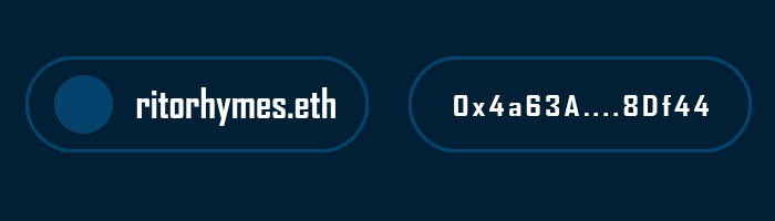
Address truncation follows the standard Web3 pattern of showing the first 6 and last 4 characters: 0x1234...7890. This format provides enough information for users to recognize their wallets while keeping the display compact.
ENS truncation activates for names exceeding 15 characters. For .eth identities, the algorithm preserves the first 11 characters and keeps the .eth suffix visible (verylongens...eth). Non-.eth names retain their first 11 and last 4 characters to keep both the prefix and identifying suffix in view (averylongna...tld). This approach maintains readability while preventing extremely long names from breaking layout constraints.
Props Reference
| Prop | Type | Default | Description |
|---|---|---|---|
variant | "topnav" | "bottomnav" | "no-nav" | "no-nav" | Controls responsive visibility behavior. The topnav variant displays only above 1100px, bottomnav only below 1100px, and no-nav always displays. See the Navbar System Guide for complete variant system documentation. |
Variant System Behavior
The variant prop controls CSS-based responsive visibility, which operates independently from the component’s connection state logic. While connection state determines whether the component renders at all through conditional rendering, the variant system uses CSS classes to show or hide already-rendered components based on viewport width.
| Variant Value | Visible Range | Hidden Range | Use Case |
|---|---|---|---|
"topnav" | 1100px and above | Below 1100px | Desktop navigation bars |
"bottomnav" | Below 1100px | 1100px and above | Mobile bottom navigation |
"no-nav" (default) | Always visible | Never hidden | Standalone usage outside navigation |
| No prop provided | Always visible | Never hidden | Same as "no-nav" |
This CSS-based approach ensures smooth responsive behavior without the performance overhead of mounting and unmounting components during viewport changes. The component remains in the DOM regardless of variant visibility, maintaining its internal state across breakpoint transitions.
CSS Architecture
The widget’s visual behavior is controlled through CSS modules that implement sophisticated state-based styling. Understanding these CSS patterns helps when customizing or debugging the component’s appearance.
Animation Keyframes
The initial fade-in effect uses a simple opacity animation:
@keyframes fadeIn {
  from { opacity: 0; }
  to   { opacity: 1; }
}
This animation applies to the button container on mount, creating the smooth entrance effect. The one-second duration balances visibility with performance, ensuring users see the widget appear without feeling delayed.
State-Driven Visibility Classes
The CSS module defines several state classes that control element visibility:
.address.hideAddress {
  opacity: 0;
}

.ens.showEns {
  opacity: 1;
}

.avatarWrapper.showAvatar {
  width: 24px;
  opacity: 1;
}
These classes work with the component’s state management to create synchronized transitions. The avatar wrapper particularly demonstrates sophisticated behavior, transitioning both width and opacity to create a slide-and-fade effect.
Responsive Variant System
The variant classes integrate with the global wallet variant system defined in styles/wallet-variants.css. For complete documentation of how these variants control responsive behavior across breakpoints, refer to the Navbar System Guide.
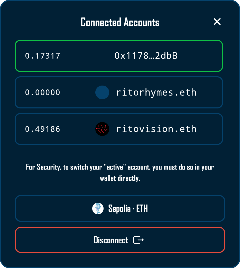
Integration with AccountModal
Clicking the AddressDisplay widget opens the AccountModal, providing users with expanded wallet information and management options. This interaction creates a natural hierarchy where the widget serves as both an ambient information display and an entry point to deeper wallet functionality. The modal receives its open state through the isModalOpen state variable and can be closed through the onClose callback.
Usage Examples
Basic Implementation
import AddressDisplay from '@/components/wallet/addressDisplay/AddressDisplay';

// Standalone usage anywhere in your application
function CustomPanel() {
  return (
    <div className={styles.panel}>
      <AddressDisplay />
    </div>
  );
}
Navigation Integration
// Desktop navigation bar
<div className={styles.topNav}>
  <AddressDisplay variant="topnav" />
</div>

// Mobile bottom navigation
<div className={styles.bottomNav}>
  <AddressDisplay variant="bottomnav" />
</div>
Best Practices
When implementing AddressDisplay, ensure the component has access to Wagmi’s configuration through your application’s provider hierarchy. The widget automatically handles all connection state changes, so avoid wrapping it in conditional rendering based on wallet state—let the component manage its own visibility.
For custom styling needs, extend the existing CSS module rather than overriding styles inline. This approach maintains the careful timing relationships between visual states while allowing design customization.
Consider the widget’s placement carefully within your layout. While it adapts to various container widths, providing adequate horizontal space ensures ENS names and avatars display optimally without triggering aggressive truncation.
The AddressDisplay widget always performs ENS lookups against Ethereum mainnet, regardless of the user’s current network. This behavior aligns with ENS’s mainnet-only deployment and ensures consistent identity resolution across all supported chains.
Playground
Use the full Storybook UI to explore the widget states and tweak controls in real time.