ProcessingModal
The ProcessingModal component provides essential user feedback during blockchain transactions, guiding users through wallet interactions and offering recovery options when transactions become stuck. This specialized modal serves as a critical bridge between the application and wallet interfaces, particularly on mobile devices where it enables seamless deep-linking to wallet applications. Through its careful design and mobile-aware features, it transforms potentially confusing transaction states into clear, actionable user experiences.
Component Architecture
ProcessingModal implements a sophisticated visibility system that goes beyond simple show/hide functionality. The component manages its own rendering lifecycle to enable smooth CSS transitions, maintains separate state for DOM presence and visual appearance, and provides platform-specific features like mobile wallet deep-linking. This architecture ensures the modal appears and disappears smoothly while providing immediate functionality when needed.
Modal State Management
The component uses a two-phase visibility system to enable proper CSS transitions:
const [shouldRender, setShouldRender] = useState(false)
const [isShowing, setIsShowing] = useState(false)
This separation allows the modal to remain in the DOM during exit animations while CSS handles the visual transition, creating a polished user experience.
Transition Timing
Entry Phase
- Component adds to DOM (
shouldRender = true) - After 50ms delay, CSS transition begins (
isShowing = true) - Modal fades in over 1 second CSS transition duration
Exit Phase
- CSS transition begins immediately (
isShowing = false) - Modal fades out over 1 second CSS transition duration
- After 1000ms, component removes from DOM (
shouldRender = false)
This timing ensures smooth animations while preventing the modal from lingering invisibly in the DOM. The total entry time is approximately 1.05 seconds (50ms delay + 1s fade), while exit takes 1 second.
Props Interface
ProcessingModal accepts a minimal but essential set of props:
| Prop | Type | Description |
|---|---|---|
isVisible | boolean | Controls modal visibility state |
onCancel | () => void | Callback when cancel button clicked |
transactionHash | 0x${string} | null | Optional transaction hash for block explorer link |
The transaction hash prop enables the modal to provide direct links to block explorers, allowing users to monitor their transaction status in real-time.
Transaction Tracking with Block Explorer Integration
One of ProcessingModal’s most powerful features is its ability to provide direct links to block explorers for pending transactions. This functionality transforms an otherwise opaque waiting period into a transparent process where users can track their transaction’s progress through the blockchain.
Dynamic Block Explorer URL Generation
The component intelligently determines the appropriate block explorer based on the current network:
const getBlockExplorerUrl = (hash: string) => {
  const chainId = getTargetChainId()

  switch (chainId) {
    case CHAIN_IDS.sepolia:
      return `https://sepolia.etherscan.io/tx/${hash}`
    case CHAIN_IDS.ethereum:
      return `https://etherscan.io/tx/${hash}`
    case CHAIN_IDS.ritonet: {
      const ritonetExplorerUrl = publicEnv.NEXT_PUBLIC_LOCAL_BLOCKCHAIN_EXPLORER_URL
      return ritonetExplorerUrl ? `${ritonetExplorerUrl}/tx/${hash}` : null
    }
    default:
      return null
  }
}
By reusing the same lowercase CHAIN_IDS enum and the publicEnv helper that drive the rest of the dapp configuration, the modal stays aligned with the runtime environment. This approach supports Ethereum mainnet with Etherscan integration, the Sepolia testnet for development environments, and custom networks like Ritonet where the explorer URL is provided via environment variables.
Transaction Hash Lifecycle
The component manages the transaction hash display through careful state management:
useEffect(() => {
  if (transactionHash && isVisible) {
    const url = getBlockExplorerUrl(transactionHash)
    if (url) {
      setShowExplorerLink(true)
      setCurrentExplorerUrl(url)
    }
  }
}, [transactionHash, isVisible])
When a parent component passes a transaction hash, the modal automatically generates and displays the appropriate block explorer link. This link appears seamlessly within the modal interface, providing users with immediate access to transaction details.
Explorer Link Reset
The component implements proper cleanup when the modal closes:
useEffect(() => {
  if (!isVisible) {
    const resetTimer = setTimeout(() => {
      setShowExplorerLink(false)
      setCurrentExplorerUrl(null)
    }, 1000) // Reset after fade out completes
    return () => clearTimeout(resetTimer)
  }
}, [isVisible])
This ensures the explorer link doesn’t persist between different transactions, preventing confusion if the modal is reused for multiple operations.
User Interface Integration
The block explorer link appears prominently within the modal when a transaction is pending:
{showExplorerLink && currentExplorerUrl && (
  <a
    href={currentExplorerUrl}
    target="_blank"
    rel="noopener noreferrer"
    className={styles.explorerLink}
  >
    Pending TX at Block Explorer
  </a>
)}
The link opens in a new tab, allowing users to monitor their transaction without leaving the application. This design choice maintains application context while providing transparency into blockchain operations.
The block explorer integration is particularly valuable for development environments where Blockscout provides detailed transaction debugging information. For production networks, it offers users peace of mind by showing real-time confirmation progress.
Mobile Device Detection
ProcessingModal uses the isMobileDevice() utility to determine platform-specific features:
const isMobile = isMobileDevice()This detection combines multiple strategies for accuracy. It checks for touch support through ontouchstart events or maxTouchPoints, analyzes the user agent string for mobile keywords, and considers viewport width as a secondary indicator. This multi-faceted approach ensures reliable mobile detection across various devices and browsers.
Wallet Deep-Linking
On mobile devices, the modal displays an additional Open Wallet button that triggers a best-effort deeplink:
{isMobile && (
  <button
    data-testid="open-wallet-button"
    className={styles.openWalletButton}
    onClick={() => openWalletDeeplink()}
  >
    Open Wallet
  </button>
)}
The openWalletDeeplink helper still uses a WalletConnect-style placeholder URI, but it now reuses the active chooser-selected wallet launcher when the current session came from Choose Mobile Wallets. Generic WalletConnect sessions still fall back to the raw placeholder URI.
The Open Wallet button only appears on mobile devices where deep-linking is supported. Desktop users must manually switch to their wallet extension or application. When an active chooser wallet exists, the button label becomes Open <Wallet Name>.
Dedicated OpenWalletButton Component
Mobile surfaces outside the modal reuse the same deeplink helper through the OpenWalletButton component found at components/wallet/OpenWalletButton. It renders only when isMobileDevice() is true, the user is connected, and the connector id is walletConnect. Clicking the button calls openWalletDeeplink, giving users a consistent entry point to reopen their wallet whether they are inside the modal or elsewhere in the UI. Both buttons now share the same active chooser-wallet memory and dynamic label logic (see OpenWalletButton.test.tsx for the gating logic).
Cancel Functionality
The cancel button serves a specific purpose in the transaction flow:
<button
  data-testid="cancel-button"
  className={styles.cancelButton}
  onClick={onCancel}
>
  Cancel
</button>
The cancel functionality does not actually cancel blockchain transactions. Instead, it resets the UI state of the parent component, allowing users to recover from stuck states or retry operations. The modal includes explanatory text to set proper expectations about transaction cancellation.
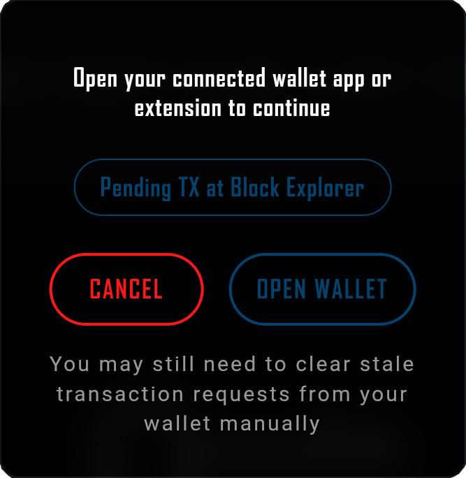
Modal Content Structure
The modal presents information in a clear hierarchy:
<div className={styles.modal}>
  <p className={styles.message}>
    Open your connected wallet app or extension to continue
  </p>

  {showExplorerLink && currentExplorerUrl && (
    <a
      href={currentExplorerUrl}
      target="_blank"
      rel="noopener noreferrer"
      className={styles.explorerLink}
    >
      Pending TX at Block Explorer
    </a>
  )}

  <div className={styles.buttonRow}>
    {/* Buttons */}
  </div>
  <p className={styles.subtext}>
    You may still need to clear stale transaction requests from your wallet manually
  </p>
</div>
The primary message provides immediate guidance, the optional block explorer link offers transaction transparency, action buttons provide clear next steps, and subtext manages expectations about transaction handling.
CSS Implementation
ProcessingModal uses CSS modules for scoped styling with sophisticated transition effects:
Overlay Transitions
.modalOverlay {
  opacity: 0;
  transition: opacity 1s ease;
}

.modalOverlay.visible {
  opacity: 1;
}
The overlay fades in and out smoothly over 1 second, providing visual continuity during modal lifecycle.
Modal Positioning
.modalOverlay {
  position: fixed;
  top: 80px; /* Below nav bar */
  left: 50%;
  transform: translateX(-50%);
  z-index: 1000;
  opacity: 0;
  transition: opacity 1s ease-in-out;
  pointer-events: none;
}

.modalOverlay.visible {
  opacity: 1;
  pointer-events: auto;
}

.modal {
  background: rgba(0, 0, 0, 0.95);
  border-radius: 12px;
  padding: 2rem;
  min-width: 320px;
  max-width: 400px;
}
Rather than stretching edge-to-edge, the overlay anchors itself at the horizontal center of the viewport and enables pointer events only while it is visible. This keeps the modal visually tied to the wallet action area while still dimming the background and preventing stray interactions.
Responsive Design
The modal adapts its layout and sizing for mobile devices, ensuring buttons remain easily tappable and text remains readable at smaller viewport sizes.
Deeplink Helper Integration
ProcessingModal imports the deeplink helper directly:
import { openWalletDeeplink } from '@/app/utils/walletDeeplink'This keeps the click handler local while still delegating launcher memory and URL construction to the shared deeplink helper.
Lifecycle Management
The component implements careful lifecycle management to prevent memory leaks:
useEffect(() => {
  if (isVisible) {
    setTimeout(() => setShouldRender(true), 0)
    const showTimer = setTimeout(() => {
      setIsShowing(true)
    }, 50)
    return () => clearTimeout(showTimer)
  } else {
    setTimeout(() => setIsShowing(false), 0)
    const hideTimer = setTimeout(() => {
      setShouldRender(false)
    }, 1000)
    return () => clearTimeout(hideTimer)
  }
}, [isVisible])
Zero-delay timeouts decouple these state flips from the render cycle so that CSS transitions can start cleanly. All timers are cleared when the component unmounts or when visibility changes, preventing potential memory leaks.
Integration Patterns
ProcessingModal is typically integrated within transaction-handling components like ButtonSection:
function TransactionComponent() {
  const isProcessing = isMinting || isBurning || isConfirming
  const transactionHash = mintHash || burnHash // Current transaction hash

  const handleCancel = async () => {
    resetTransactionState()
    await refreshData()
  }

  return (
    <>
      {/* Main UI */}
      <ProcessingModal
        isVisible={isProcessing}
        onCancel={handleCancel}
        transactionHash={transactionHash} // Pass hash for explorer link
      />
    </>
  )
}
The modal appears automatically when transaction processing begins, displays the block explorer link when a hash is available, and disappears when the transaction completes.
Testing Strategies
Testing ProcessingModal requires mocking both mobile detection and the deeplink helper:
vi.spyOn(mobileUtils, 'isMobileDevice').mockReturnValue(true)
vi.spyOn(walletDeeplink, 'openWalletDeeplink').mockImplementation(mockOpenWallet)
Key test scenarios include verifying correct rendering based on visibility prop, ensuring proper button display based on mobile detection, confirming cancel callback execution, validating transition timing behavior, and testing block explorer link generation for different networks.
Accessibility Considerations
ProcessingModal implements accessible keyboard handling in addition to semantic structure. A visually hidden heading announced through aria-labelledby gives context, focus automatically moves to the Cancel button when the modal opens, Tab/Shift+Tab are trapped within the modal, pressing Escape calls onCancel, and focus returns to the previously active control after the modal closes. These behaviors keep keyboard and assistive-technology users in sync with the modal lifecycle.
Performance Characteristics
The component is optimized for minimal performance impact:
Conditional Rendering - Only renders when needed, reducing React reconciliation work.
CSS Transitions - Uses GPU-accelerated properties for smooth animations.
Lightweight Dependencies - Direct helper import keeps dependencies small.
Efficient State Updates - Batches state changes to minimize re-renders.
Customization Options
While ProcessingModal is designed for transaction feedback, it can be adapted for other use cases:
Additional Actions
Extra buttons can be added for specific workflows beyond the block explorer link.
Styling Variants
CSS modules allow complete visual customization while maintaining functionality.
Common Issues and Solutions
| Issue | Cause | Solution |
|---|---|---|
| Modal appears/disappears instantly | Missing CSS transitions | Verify CSS module imports |
| Open Wallet button missing on mobile | Mobile detection failing | Check isMobileDevice logic |
| Cancel doesn’t reset state | Improper callback implementation | Ensure parent handles state reset |
| Modal remains after transaction | isVisible not updated | Verify parent state management |
| Explorer link not appearing | Missing transaction hash prop | Ensure parent passes hash when available |
Best Practices
When implementing or extending ProcessingModal:
Clear Messaging - Always provide clear, actionable guidance about what users should do next.
Proper Expectations - Make it clear that cancel only resets UI state, not blockchain transactions.
Mobile Testing - Test wallet deep-linking on actual devices rather than browser emulation.
Error Recovery - Ensure the cancel callback properly resets all relevant state for retry attempts.
Transition Timing - Maintain consistent timing with other UI animations for cohesive feel.
Transaction Transparency - Always pass transaction hashes when available to enable block explorer links.
Integration with Transaction Flow
ProcessingModal plays a specific role in the transaction lifecycle:
Transaction Initiated
Parent component starts blockchain transaction and sets processing state to true.
Modal Appears
ProcessingModal renders with appropriate message and button options.
Transaction Hash Available
Parent component receives hash from blockchain and passes it to modal.
Explorer Link Appears
Modal displays block explorer link for transaction tracking.
User Waits or Acts
User either waits for wallet interaction, uses Open Wallet button on mobile, or clicks explorer link.
Transaction Completes or Fails
Parent component detects completion and sets processing state to false.
Modal Disappears
ProcessingModal animates out and removes itself from DOM.
This flow ensures users always understand the current state and have options for proceeding or monitoring progress.
Future Enhancement Possibilities
The ProcessingModal pattern could be extended for additional functionality such as transaction progress indicators showing confirmation counts, estimated time remaining based on network conditions, real-time updates from block explorer APIs, and automated timeout handling with retry options. These enhancements would maintain the component’s focus on user guidance while providing more detailed feedback for advanced users.
Summary
ProcessingModal represents a focused solution to a specific UX challenge in blockchain applications. By providing clear feedback during transaction processing, enabling mobile wallet deep-linking, offering recovery options through the cancel mechanism, and providing direct block explorer access for transaction monitoring, it significantly improves the user experience during one of Web3’s most friction-filled moments. The component’s careful attention to transition timing, mobile optimization, clear messaging, and transaction transparency demonstrates how thoughtful design can smooth the rough edges of blockchain interaction. While simple in concept, its implementation showcases best practices for modal management, mobile detection, user communication, and blockchain transparency that can be applied throughout Web3 applications.
Playground
Use the full Storybook UI to explore the modal states and tweak controls in real time.