Asset Display Components
The asset display layer provides specialized visual components for rendering different types of blockchain assets. These components handle the complexities of displaying fungible tokens, non-fungible tokens, and native currencies with appropriate formatting, error handling, accessibility, and responsive design.
Asset metadata, including normalized image URLs and token details, is prepared in the data layer so the display components can focus on robust, accessible rendering. Any IPFS URL normalization (e.g., converting ipfs:// URIs to HTTP(S) gateways) is handled before data reaches this layer. At the route level, pages can be wrapped in error boundaries that report unexpected failures to an error-monitoring service (such as Sentry) and show a retry-capable error surface.
Component Architecture
The asset display system consists of four interconnected components that work together to present blockchain assets effectively. AssetDisplay serves as the primary component that determines which specialized display to use based on asset type. AssetsGrid provides the layout container for multiple assets with loading and empty states. TokenAccordionContent integrates with the data layer to fetch and display assets on demand and coordinate pagination. NativeBalance shows blockchain native currencies using real-time balance data from wagmi.
- AssetDisplay.tsx
- AssetsGrid.tsx
- TokenAccordionContent.tsx
- NativeBalance.tsx
- index.ts
AssetDisplay Component
The AssetDisplay component serves as the intelligent router for asset rendering, automatically detecting asset types and delegating to specialized display components. This component demonstrates type discrimination and tailored rendering for various blockchain assets, including ERC-20 tokens, ERC-721 NFTs, and ERC-1155 NFTs.

Type Discrimination Logic
The component uses TypeScript type guards to distinguish between fungible and non-fungible tokens, ensuring type-safe rendering paths. The discrimination logic checks for specific properties unique to each asset type:
function isERC20(asset: Asset): asset is ERC20Asset {
  return 'symbol' in asset && 'decimals' in asset
}
This approach provides compile-time type safety while maintaining runtime flexibility for different asset structures. ERC-721 and ERC-1155 tokens share a common NFTAsset shape, with ERC-1155 tokens adding an optional balance field that is surfaced in the UI when present.
ERC-20 Token Display
The ERC20Display sub-component handles fungible token presentation with sophisticated balance formatting and visual design. The component addresses several key challenges in token display.
Balance formatting represents one of the most complex aspects of token display due to varying decimal places across tokens. The component implements an intelligent formatting system that:
- Handles high-precision numbers up to 16 significant digits
- Prevents scientific notation for better readability
- Trims unnecessary trailing zeros
- Provides a consistent fallback of
0.00000for zero balances
const formatBalance = (balance: string, decimals: number) => {
  const rawStr = formatUnits(BigInt(balance), decimals)
  const raw = parseFloat(rawStr)

  if (!raw) return '0.00000'

  let result = raw.toPrecision(16)

  // Prevent exponential notation
  if (result.includes('e')) {
    const intPart = Math.floor(raw).toString()
    const maxDecimals = Math.max(0, 16 - intPart.length - 1)
    result = raw.toFixed(maxDecimals)
  }

  // Clean up formatting
  if (result.includes('.')) {
    result = result.replace(/\.?0+$/, '')
  }

  return result.startsWith('.') ? '0' + result : result
}
Fiat value display is optional. When a price field is present, the component calculates and renders a human-readable value (for example, $12.50). If pricing is unavailable, the value row is simply omitted, so consumers do not need to special-case missing price data.
Token logos load through the shared ProgressiveImage wrapper, which shows the animated Orb placeholder while the actual image streams. Once the network request completes, the logo fades in over the same circular frame, keeping the layout stable. If the request fails or the token metadata lacks a logo URL, the component hides the placeholder and renders a deterministic badge composed of the token symbol’s first two characters. This dual-path strategy ensures consistent presentation without misleading users about which imagery is first-party versus generated.
NFT Display
The NFTDisplay sub-component handles the unique challenges of presenting non-fungible tokens, including image loading, orientation detection, metadata display, and ERC-1155 balances.
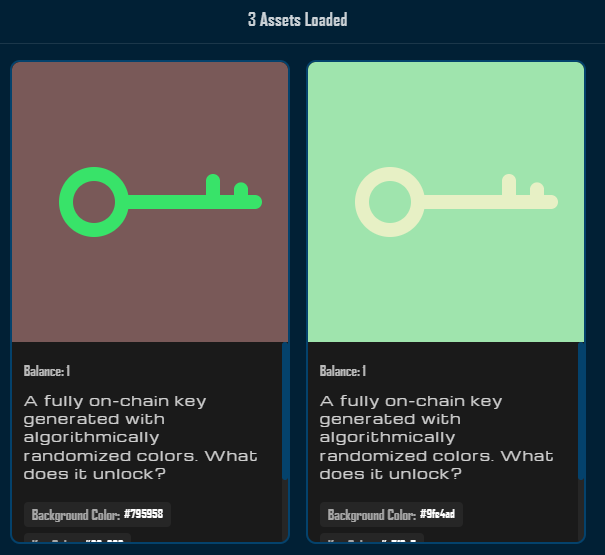
Image handling represents a critical aspect of NFT display. The component preloads each NFT image using a background Image object to detect its dimensions and infer orientation. On successful load, it classifies the image as landscape or portrait and applies the corresponding layout class. Rendering is delegated to ProgressiveImage, but the Orb placeholder is intentionally disabled for NFT artwork so users never confuse the animation for the actual token image. If the network request fails or no URL is provided, the card falls back to a “No Image” placeholder, and explicit load failures are annotated with a small “Failed to load” label so users understand why an image is missing.
The image loading state is tracked through React hooks:
useEffect(() => {
  let img: HTMLImageElement | null = null

  if (!isERC20(asset) && asset.image && !imageError) {
    img = new Image()

    img.onload = () => {
      setImageOrientation(img!.width > img!.height ? 'landscape' : 'portrait')
    }
    img.onerror = () => {
      setImageError(true)
    }

    img.src = asset.image
  }

  return () => {
    if (img) {
      img.onload = null
      img.onerror = null
      img.src = ''
      img = null
    }
  }
}, [asset, imageError])
The component displays NFT metadata by showing the token name and ID prominently, followed by an optional balance line for ERC-1155 tokens when a balance field is present. It then renders up to four attributes as labeled chips. When tokens have more than four attributes, the component displays a count indicator showing how many additional attributes exist.
When an NFT lacks a name property, the component falls back to displaying the token ID in the format Token #1234, ensuring every card has a meaningful title.
NFT images from IPFS sources may load slowly or fail due to gateway availability. IPFS URIs should be converted to HTTP(S) gateway URLs in the data layer before being passed into these display components. For production applications, developers should consider implementing their own IPFS infrastructure or dedicated gateway for greater reliability.
AssetsGrid Component
The AssetsGrid component provides the layout foundation for displaying multiple assets in a responsive grid format. It handles three distinct states to ensure optimal user experience across all scenarios.
Loading State Management
The component implements a loading state that provides visual feedback during data fetching. When the loading prop is true, the grid is replaced with a centered spinner and descriptive text ("Loading assets..."). The loading container uses role="status" and aria-live="polite" so assistive technologies receive unobtrusive updates while assets are being retrieved.
Empty State Design
When no assets are found and loading is false, the component displays a clear empty state message: "No Assets Found!". This prevents user confusion and provides immediate feedback about the query results. The empty state also uses role="status" and aria-live="polite" to announce that there are no assets to show.
Grid Layout System
The responsive grid adapts to different screen sizes and asset counts, providing optimal display across devices. Instead of CSS Grid, the layout uses a flexbox-based grid with breakpoint-driven column widths. On desktop, it fits three cards per row; on tablets, it falls back to two columns; and on mobile, it collapses to a single column. Each card has a minimum width so asset content does not become cramped while still making efficient use of the available space.
.grid {
  display: flex;
  flex-wrap: wrap;
  gap: 16px;
  padding: 16px;
  justify-content: center;
}

.grid > * {
  flex: 0 1 calc(33.333% - 11px);
  min-width: 280px;
  max-width: calc(33.333% - 11px);
}

@media (max-width: 1024px) {
  .grid > * {
    flex: 0 1 calc(50% - 8px);
    max-width: calc(50% - 8px);
    min-width: 250px;
  }
}

@media (max-width: 640px) {
  .grid {
    gap: 12px;
    padding: 12px;
  }

  .grid > * {
    flex: 1 1 100%;
    max-width: 100%;
    min-width: unset;
  }
}
Each rendered asset is wrapped in role="row" and role="gridcell" containers inside a role="grid" parent, which improves navigation for assistive technologies.
TokenAccordionContent Component
The TokenAccordionContent component serves as the integration point between the data layer and display layer, orchestrating asset fetching and rendering within the accordion interface.
Data Integration
The component leverages a useAssets hook to fetch assets on demand. It receives parameters such as address, chainId, and tokenType, and returns a flat assets array alongside pagination and status flags. In common usage, the accordion only mounts this content when a section opens, so initial asset fetching is naturally deferred until the user expands the panel.
Prefetch Optimization
The component supports an optional prefetch callback via the onHover prop. When provided, this callback is invoked in an effect as soon as the content mounts or whenever the callback reference changes:
useEffect(() => {
  if (onHover) {
    onHover()
  }
}, [onHover])
This pattern gives parent components a simple hook for warming up data before the user fully engages with a section. Parents can wire this callback to hover or focus events on the accordion trigger so that data begins loading before the panel is opened.
Error Recovery
Comprehensive error handling ensures users can recover from temporary failures. When useAssets reports an error, the component displays a contextual error message and a Retry button:
- The error state uses
role="alert"andaria-live="assertive"so screen readers are immediately notified. - The Retry button calls
refetch()fromuseAssetsto attempt the request again.
This pattern maintains user confidence even when backend services or third-party APIs experience issues. For unexpected errors outside the normal data-fetching lifecycle, page-level error boundaries can capture the exception and show a consistent error surface.
Infinite Scroll Integration
The component integrates with an infinite pagination system provided by useAssets. It receives hasNextPage, fetchNextPage, and isFetchingNextPage flags:
- When
hasNextPageistrueand the grid is not in the initial loading state, a “Load More Assets” button is rendered. - Clicking this button invokes
fetchNextPage(). - While
isFetchingNextPageistrue, the button switches to a compact spinner and “Loading…” label.
Assets are appended to the existing list, and scroll position is preserved, creating a smooth “load more” experience suited to large portfolios.
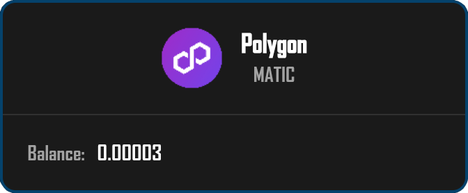
NativeBalance Component
The NativeBalance component specializes in displaying blockchain native currencies like ETH, MATIC, and AVAX. It provides real-time balance updates using wagmi’s balance hooks.
Real-Time Balance Updates
The component establishes a direct connection to blockchain data through wagmi’s useBalance hook, scoped to a given chainId and address. As new blocks are confirmed or transactions update the balance, wagmi refreshes the hook’s data and the component rerenders, keeping the displayed balance current without manual polling.
Chain-Aware Display
The component intelligently adapts to different blockchain networks by dynamically retrieving currency symbols and names from chain configuration. It reads the configured chains via useConfig(), and selects appropriate labels:
const symbol = data.symbol || chain?.nativeCurrency.symbol || 'Native'
const name = chain?.nativeCurrency.name || chain?.name || 'Native Token'
This ensures accurate display regardless of the connected network and handles edge cases where chain metadata might be incomplete.
Precision Formatting
Native balance formatting requires special attention to precision and readability. Raw values are provided in wei and converted to ether using formatEther. The component implements adaptive formatting that:
- Shows up to 8 decimal places for very small amounts (
0 < balance < 0.0001) - Shows 4 decimal places for standard amounts (
balance >= 0.0001) - Removes trailing zeros for cleaner presentation
- Displays
"0"when the balance is effectively zero
This produces human-friendly values like 1.23, 0.00001234, or 0, without scientific notation.
During the loading phase, the component renders a spinner within a container marked as role="status" with aria-live="polite". If an error occurs or no data is available, the component returns null, allowing parent components or page-level error boundaries to decide how to surface failure states.
Visual Design System
All asset display components follow a cohesive visual design system that ensures consistency across different asset types while allowing for type-specific optimizations.
Design Principles
The visual design prioritizes clarity and information hierarchy. Each asset card uses consistent spacing and typography while adapting layouts based on content type. Color coding and subtle visual indicators help users quickly identify asset types and states without overwhelming them.
Responsive Behavior
Components implement responsive design through CSS modules that provide scoped styling without global conflicts. Media queries ensure optimal display across devices, from mobile phones to desktop monitors. The AssetsGrid layout uses a flexbox-based grid that gracefully reflows from three columns on large screens to two columns on tablets and a single column on narrow mobile devices. The design system maintains touch-friendly interaction targets on mobile devices while providing hover states for desktop users.
Accessibility Features
The asset display components implement accessibility features that make them usable with screen readers and keyboard navigation:
AssetsGridusesrole="grid"withrole="row"androle="gridcell"wrappers for each asset.- Individual asset cards and native balance panels use
sectionelements withrole="region"andaria-labelledby(and optionallyaria-describedby) so screen readers can identify and navigate regions. - Loading and empty states use
role="status"witharia-live="polite"so users are notified when assets are loading or when no assets are found. - Error states in
TokenAccordionContentuserole="alert"witharia-live="assertive"to announce failures promptly. - Buttons such as “Retry” and “Load More Assets” use native button semantics, ensuring they are automatically keyboard focusable and activated with standard keyboard interactions.
Performance Optimization
The asset display layer implements several performance optimizations to ensure smooth scrolling and interaction even with large asset collections.
Image Optimization
NFT images often represent the largest performance bottleneck in portfolio applications. The display components address this through error-tolerant loading patterns that prevent the UI from breaking when image sources are unreliable. Actual IPFS-to-HTTP gateway conversion is handled upstream in the data layer, which passes normalized HTTP(S) URLs into the components. Within the UI layer, failed images fall back to a “No Image” placeholder and do not block rendering of the rest of the card.
Render Optimization
The components are structured to minimize unnecessary renders through careful component hierarchy design and localized state management. For example:
- Orientation and error state for NFT images are scoped to the individual
NFTDisplayinstance, rather than lifting state into the grid. - Loading and empty states are handled at the
AssetsGridlevel, avoiding extra work inside each card while data is still being fetched.
By isolating state changes to the smallest practical component scope, the system reduces the rendering workload during user interactions.
Memory Management
Large asset collections can consume significant memory. The NFT image loader implements cleanup strategies by removing event listeners and clearing the Image object on unmount. This prevents memory leaks and dangling references when users navigate between portfolio views or rapidly expand and collapse accordions.
Testing Strategies
The asset display components include targeted test coverage focusing on visual correctness and user interaction in core scenarios.
AssetDisplay Tests
The AssetDisplay component test suite verifies the correct rendering of both ERC-20 tokens and NFTs:
- For ERC-20 tokens, tests ensure that token names, symbols, balances, and calculated values display correctly. The formatting logic is tested with various balance amounts, including the edge case of zero balances, which should display as
0.00000. - NFT display tests verify fallback behavior when critical data is missing. When no image URL is provided, the component displays a
"No Image"placeholder. When an NFT lacks anameproperty, the component falls back to displaying the token ID in the formatToken #1234.
These tests focus on the most user-visible aspects of asset rendering.
AssetsGrid Tests
The AssetsGrid component tests focus on the three primary states of the grid system:
- Loading state tests verify that a loading indicator appears when the
loadingprop istrue, and that no asset items render during this phase. - Empty state tests confirm that
"No Assets Found!"displays when the assets array is empty andloadingisfalse. - Rendering tests verify that providing multiple assets results in the same number of
AssetDisplayinstances being rendered, ensuring the grid correctly maps over the assets array regardless of asset type.
NativeBalance Tests
The NativeBalance component test suite covers all three states of balance fetching:
- During the loading phase, tests verify that a spinner element renders to provide visual feedback.
- Error handling is tested by confirming the component returns an empty DOM output when an error occurs, allowing parent components or page-level error boundaries to handle the error state as appropriate.
- When balance data loads successfully, tests verify that the formatting logic correctly converts wei values to human-readable format. The test suite also confirms that chain metadata, including currency symbols, displays correctly alongside the formatted balance.
Together, these tests provide focused coverage of the most important behaviors without attempting to exhaustively validate every visual detail.
Error Handling Patterns
The asset display components implement consistent error handling patterns that provide clear feedback for users while integrating with higher-level error boundaries.
Image Loading Failures
NFT images may fail to load due to various reasons including CORS restrictions, gateway timeouts, or invalid URLs. The components handle these failures locally by:
- Displaying a “No Image” placeholder when images are missing or fail to load
- Optionally showing a small “Failed to load” label when an error occurs
This prevents the layout from breaking and avoids cascading failures even when image sources are unreliable.
Metadata Handling
Token metadata may be malformed or incomplete. The components implement defensive fallbacks for missing fields, such as:
- Displaying
Token #<id>when an NFT name is missing - Falling back to generic native token labels when chain metadata is incomplete (
Native/Native Token)
More complex validation and normalization of metadata (including IPFS URL handling) is delegated to the data layer, so the display components can remain focused on presentation concerns.
Network Errors
Balance fetching for native tokens may fail due to network issues or provider errors. The NativeBalance component handles these scenarios by returning null when errors occur, allowing parent components, route-level error boundaries, or page shells to decide how to surface failure states in the overall layout.
Best Practices
When working with asset display components, follow these guidelines to ensure optimal results.
Development Guidelines
- Define proper TypeScript types for asset data to catch errors at compile time.
- Use the provided components’ built-in formatting behaviors rather than re-implementing balance formatting in multiple places.
- Test with various asset types and edge cases including zero balances, missing metadata, and mixed ERC-20/NFT collections.
- Implement proper loading and error states for all asynchronous operations at the composition level (e.g., accordion panels and pages).
- Consider performance implications when displaying large asset collections, especially for NFT-heavy portfolios.
Image Handling
- For NFT images, always implement error handling with appropriate fallbacks at the display layer.
- Normalize IPFS URIs in the data layer so
AssetDisplayreceives HTTP(S) URLs wherever possible. - Monitor image loading performance and implement caching strategies (such as using
cachedUrlfields from upstream APIs) where appropriate. - Be mindful of CORS and gateway constraints when relying on third-party NFT providers.
Balance Display
- When displaying token balances, use the asset display components’ built-in formatting to ensure consistency.
- Consider the token’s typical usage when interpreting displayed precision. High-value or low-liquidity tokens may warrant extra attention to visible decimals.
- Always handle edge cases like zero balances and extremely large numbers.
- Ensure proper decimal handling based on token configuration and chain metadata so users see accurate balances across different networks.
Playground
Use the full Storybook UI to explore each asset display type in an isolated sandbox.