ConnectButton Widget
- ConnectWrapper.tsx
- ConnectState.tsx
- ConnectWrapper.module.css
Overview
The ConnectButton widget serves as the primary entry point for establishing wallet connections within the RitoSwap interface. As part of the Wallet UI widget collection, it provides users with an intuitive call-to-action that appears when no wallet is connected. This widget represents the sole disconnected-state component that automatically manages its visibility based on wallet connection status.

Built on Wagmi v2’s connection state management, ConnectButton implements a thoughtful architectural split between connection logic and presentation. The component divides its responsibilities across two files: ConnectWrapper handles all Wagmi-related state management and conditional rendering logic, while ConnectState manages the user interface and modal interactions. This separation of concerns enables the connection logic to be reused elsewhere in the application while keeping the presentation layer focused and maintainable.
Component Architecture
The ConnectButton’s architecture demonstrates a clear separation between state management and presentation layers, a pattern that enhances both maintainability and reusability throughout the application.
ConnectWrapper: Connection State Management
The ConnectWrapper component serves as the intelligent container that monitors wallet connection status through Wagmi’s useAccount hook. It implements sophisticated timing logic to ensure smooth user experiences during the critical moment when users first load the application. The component waits 100 milliseconds before checking connection status, allowing Wagmi to restore any persisted sessions from localStorage. This prevents the Connect button from briefly flashing when users have previously connected wallets that are being restored.
The wrapper manages two key pieces of state from Wagmi: isConnected tracks whether a wallet is currently connected, while isConnecting indicates an active connection attempt. When either condition is true, the wrapper returns null, keeping the interface clean and preventing user confusion during connection transitions.
ConnectState: Presentation and Interaction
ConnectState owns the visual surface and the modal interaction logic. It maintains the isModalOpen state, renders the animated SVG icons, and wires the button press to the ConnectModal trigger. While the business logic lives in ConnectWrapper, this component is intentionally stateful so it can coordinate local UI feedback with the modal lifecycle.
Global modal bridge registration
Every mounted ConnectState instance calls useRegisterWalletConnectOpener(() => setIsModalOpen(true)), which registers the button with the singleton bridge defined in connectModalBridge.ts. Any other feature (e.g., LI.FI widget, gated flows) can import openWalletConnectModal() from that bridge to programmatically open whichever trigger is currently registered:
import { openWalletConnectModal } from '@/components/wallet/connectModal/connectModalBridge';

openWalletConnectModal();
The bridge always points at the most recently registered opener. When ConnectButton unmounts after a successful connection it unregisters itself, leaving the bridge with no opener unless something else—usually WalletModalHost or another surface that calls useRegisterWalletConnectOpener—is still mounted. If you need openWalletConnectModal() to remain callable post-connection, ensure another host stays registered (e.g., keep WalletModalHost mounted near the app root or mount a hidden ConnectState).
This separation keeps the Wagmi-dependent logic isolated in ConnectWrapper while ensuring UI teams can update animations or modal choreography without touching the connection layer.
Visual Design and Animation
The ConnectButton features one of RitoSwap’s signature micro-interactions that transforms a static interface element into a delightful moment of user engagement. The button displays two custom SVG icons: a electrical plug with a decorative squiggly tail and a minimalist wallet representation. These icons communicate the connection concept through universal visual metaphors that transcend language barriers.

The hover animation creates a visual narrative of connection. When users hover over the button, CSS transforms move the plug icon 5.5 pixels to the right while simultaneously moving the wallet icon 5.5 pixels to the left. This synchronized movement creates the illusion of the plug connecting to the wallet, reinforcing the action users are about to take. The animation uses a 0.3-second ease transition, providing smooth feedback without feeling sluggish.
The button’s background transitions to the application’s secondary color on hover, maintaining consistency with other interactive elements throughout RitoSwap. This dual feedback mechanism—both movement and color change—ensures accessibility for users who may have difficulty perceiving either animation type alone.
Technical Implementation
Wagmi v2 Hook Integration
ConnectButton leverages the useAccount hook from Wagmi v2 to monitor connection status. This hook provides real-time updates about wallet state, enabling the component to appear and disappear automatically as users connect and disconnect their wallets.
The component specifically monitors two properties from useAccount:
isConnected indicates whether a wallet is currently connected to the dApp. When this value is true, ConnectWrapper immediately hides the button, making room for the connected-state widgets to appear.
isConnecting tracks active connection attempts. During this transitional state, the button remains hidden to prevent users from triggering multiple connection flows simultaneously.
State Management Flow
The ConnectWrapper implements a careful state management flow that balances responsiveness with stability:
const [showButton, setShowButton] = useState(false);

useEffect(() => {
  // small delay so wagmi checks localStorage first
  const timer = setTimeout(() => {
    if (!isConnected && !isConnecting) {
      setShowButton(true);
    }
  }, 100);
  return () => clearTimeout(timer);
}, [isConnected, isConnecting]);
This delayed initialization serves a critical purpose. When users return to RitoSwap with a previously connected wallet, Wagmi needs a moment to restore the session from browser storage. Without this delay, users would see the Connect button flash briefly before being replaced by their connected wallet widgets—a jarring experience that undermines confidence in the application’s stability.
Lifecycle Mount/Unmount Summary
When variant !== "no-nav":
-
Mount Delay (100 ms)
Waits 100 ms after detectingisConnected === truebefore rendering. This gives Wagmi time to rehydrate from localStorage and prevents a brief flash of the disconnected state on reload or network switch. -
Immediate Unmount & Fade on Disconnect
As soon asisConnectedgoesfalse, setsisLeaving(opacity → 0) and unmounts the component immediately, delivering instantaneous visual feedback without stale UI.
When variant === "no-nav", the widget bypasses the delay and mounts immediately on page load.
Props Reference
| Prop | Type | Default | Description |
|---|---|---|---|
variant | "topnav" | "bottomnav" | "no-nav" | "no-nav" | Controls responsive visibility behavior. The topnav variant displays only above 1100px, bottomnav only below 1100px, and no-nav always displays. See the Navbar System Guide for complete variant system documentation. |
Variant System Behavior
The variant prop controls CSS-based responsive visibility, which operates independently from the component’s connection state logic. While connection state determines whether the component renders at all through conditional rendering, the variant system uses CSS classes to show or hide already-rendered components based on viewport width.
| Variant Value | Visible Range | Hidden Range | Use Case |
|---|---|---|---|
"topnav" | 1100px and above | Below 1100px | Desktop navigation bars |
"bottomnav" | Below 1100px | 1100px and above | Mobile bottom navigation |
"no-nav" (default) | Always visible | Never hidden | Standalone usage outside navigation |
| No prop provided | Always visible | Never hidden | Same as "no-nav" |
This CSS-based approach ensures smooth responsive behavior without the performance overhead of mounting and unmounting components during viewport changes. The component remains in the DOM regardless of variant visibility, maintaining its internal state across breakpoint transitions.
CSS Architecture
The widget’s visual behavior is controlled through CSS modules that implement the signature connection animation and responsive styling.
Animation Sequences
The component implements two distinct animation types that work together to create a polished user experience:
@keyframes fadeIn {
  from { opacity: 0; }
  to   { opacity: 1; }
}

.button:hover .plug {
  transform: translateX(5.5px);
}
.button:hover .wallet {
  transform: translateX(-5.5px);
}
The fade-in animation applies to the wrapper container when the button first appears, matching the timing of other wallet widgets for visual consistency. The transform animations on hover create the connection effect, with precise pixel values calculated to create the illusion of physical connection between the icons.
Responsive Variant System
The variant classes integrate with the global wallet variant system defined in styles/wallet-variants.css. For complete documentation of how these variants control responsive behavior across breakpoints, refer to the Navbar System Guide.
Integration with ConnectModal
Clicking the ConnectButton triggers the ConnectModal, which provides the complete wallet selection and connection flow. This modal presents available wallet options, handles provider-specific connection protocols, and manages the authentication process. The integration is handled through React state in the ConnectState component:
const [isModalOpen, setIsModalOpen] = useState(false);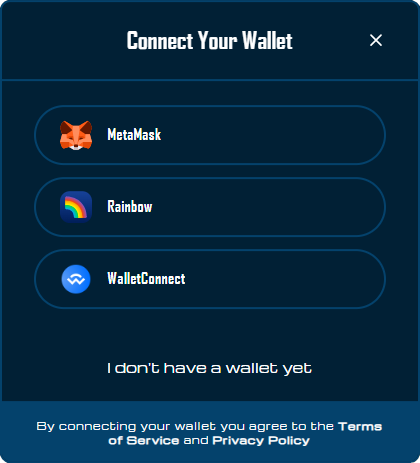
The modal receives its open state through the isModalOpen prop and can be closed through the onClose callback, maintaining a clean separation between trigger and modal components.
Modal Hosting Strategy
RitoSwap intentionally ships two hosts for the same ConnectModal:
| Trigger | Mount Location | Active When | Primary Purpose |
|---|---|---|---|
ConnectState (inline) | Wherever ConnectWrapper renders | Only while no wallet is connected | Couples the CTA button with the modal and provides immediate visual feedback for disconnected users. |
WalletModalHost (global) | app/layout.tsx | Always mounted, even after the button unmounts | Keeps the wallet picker available for programmatic flows (e.g., token gates, swaps) once a wallet is connected. |
Both hosts register with connectModalBridge.ts, and the most recently mounted instance wins. That means disconnected screens route openWalletConnectModal() to the inline button, while connected screens automatically fall back to the global host. You rarely need to think about which host is active—just call openWalletConnectModal() from business logic and the bridge handles the rest.
Usage Examples
Basic Implementation
import ConnectWrapper from '@/components/wallet/connectButton/ConnectWrapper';

// Standalone usage anywhere in your application
function CustomPanel() {
  return (
    <div className={styles.panel}>
      <ConnectWrapper />
    </div>
  );
}
Navigation Integration
// Desktop navigation bar
<div className={styles.topNav}>
  <ConnectWrapper variant="topnav" />
</div>

// Mobile bottom navigation
<div className={styles.bottomNav}>
  <ConnectWrapper variant="bottomnav" />
</div>
Best Practices
When implementing ConnectButton, ensure the component has access to Wagmi’s configuration through your application’s provider hierarchy. The widget automatically handles all connection state changes, so avoid wrapping it in conditional rendering based on wallet state—let the component manage its own visibility.
The architectural split between ConnectWrapper and ConnectState should be maintained even when customizing the component. Keep connection logic in the wrapper and presentation concerns in the state component. This separation enables easier testing, maintenance, and potential reuse of the connection logic elsewhere in your application.
For styling customizations, extend the CSS module rather than applying inline styles. The precise timing and pixel values in the hover animation have been carefully calibrated to create the connection effect, so maintain these values when modifying the animation.
The ConnectButton’s 100-millisecond initialization delay prevents visual flashing when returning users have persisted wallet sessions. This timing allows Wagmi to restore connections from localStorage before the UI renders, creating a seamless experience for repeat visitors.
Playground
Use the full Storybook UI to explore the widget states and tweak controls in real time.